Measuring Onboarding Effectiveness Beyond Completion Rate
Activation matters more than completion to predicting whether customers will renew.

Completion rate tells a vendor how fast its own team moved. It says nothing about whether the customer on the other end of that project ever got value from the product, which is the only question that predicts renewal.
Completion rate is a vendor metric, not a customer signal
Picture a dashboard that looks clean: completion is 90%, kickoff-to-go-live is 28 days, CSAT is 4.6 out of 5. Then renewal season arrives, and the account doesn't renew. Nobody on the team saw it coming, because every number they were watching was a vendor-side number: how fast the team delivered, how satisfied the buyer said they were, how many boxes got checked. None of those numbers asked whether the end user ever reached first value.
That gap exists because onboarding dashboards tend to measure one of four wrong things: completion instead of value, an average instead of a distribution, the buyer's satisfaction instead of the end user's, or a milestone the customer never actually asked for. Guideflow's 2026 analysis names the core failure directly: most programs measure completion instead of comprehension. A checklist finishing doesn't mean a user understood what to do with the product, and it doesn't mean the product solved the problem the user signed up to solve.
OnRamp's 2026 onboarding report found that a majority of CS leaders still lack real-time visibility into onboarding performance. Teams are flying blind on the very metrics that would warn them early. If the product can't tell what outcome that specific user came for, every session they spend figuring it out on their own is time added to time-to-value, and that tax gets paid on every single signup.
What the gap between signup and activation costs
The activation gap is the direct, structural result of measuring completion instead of value. Every one of those accounts is acquisition spend that produced no path to revenue.
Product-led growth makes this expensive at scale. A strong and growing majority of B2B SaaS companies now run some form of PLG motion, yet only roughly a third of them actively track activation, which happens to be the single metric that best predicts whether a free user ever converts to paying. That means most PLG companies are running their growth motion without measuring the one number that tells them if it's working.
Feature breadth makes the gap worse before it gets better. The activation event is always something the customer's user did, timed to a defined window.
A natural objection here is that churn tracking already covers this. It doesn't, because churn is a lagging signal: it confirms, months after the fact, that the activation gap was never closed. By the time a churn number moves, the window for intervention already passed. Tracking activation means catching the problem while there's still time to fix it. Tracking churn means finding out after the decision is already made.
The four-layer measurement architecture that replaces completion rate
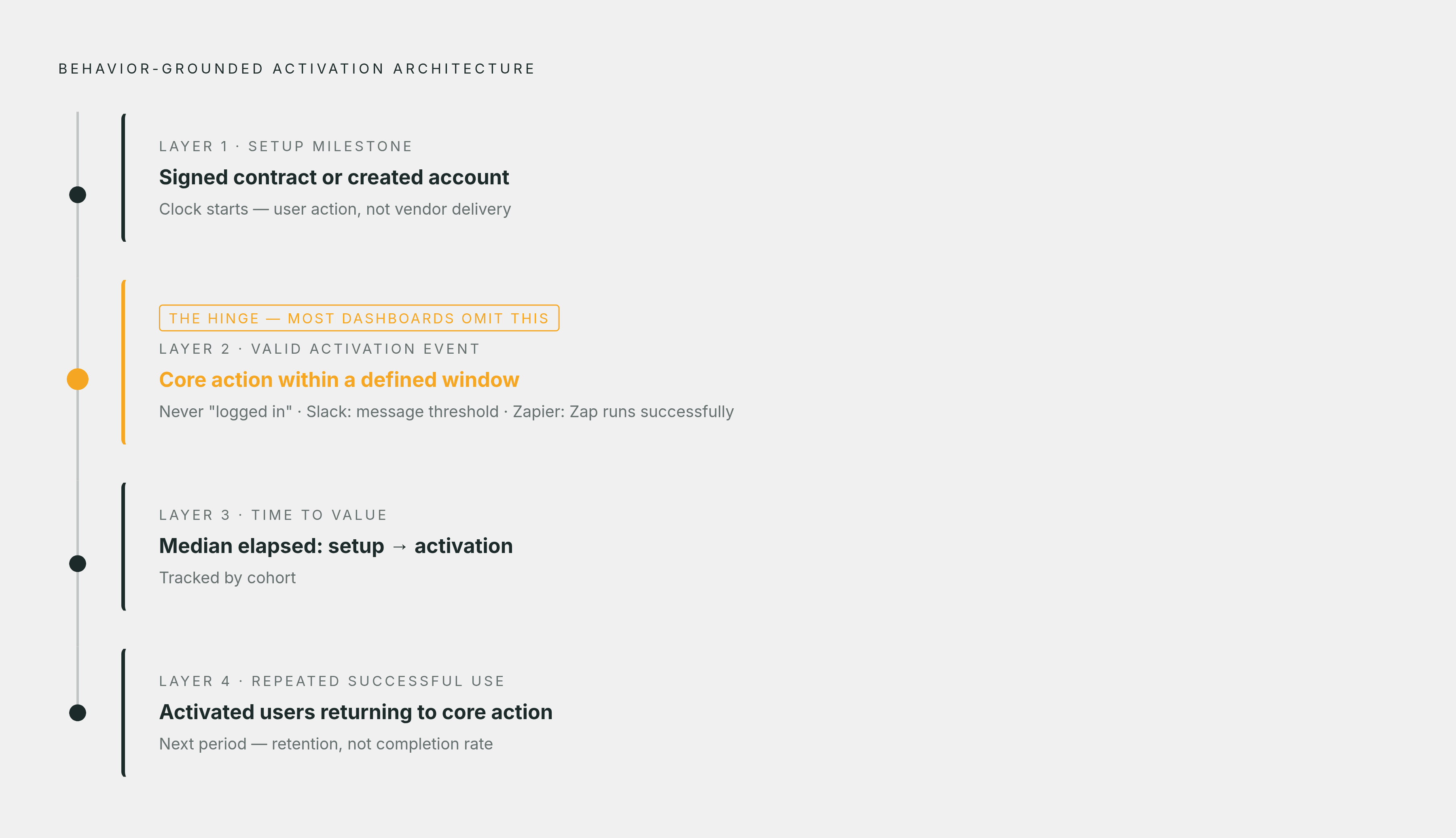
The companies that get this right don't name a completion rate anywhere in their reporting. They replace it with a behavior-grounded stack built in four layers: a setup milestone, a valid activation event tied to retention, time to value, and a repeated-use confirmation. Each layer measures something the customer's own user actually did, not something the vendor delivered.
Layer one is the setup milestone, a defined start point like a signed contract or a created account. It's the baseline the clock starts from, not a measure of success in itself. Valuecase's 2026 guide separates this further into time to first value, the first small win like running a report, connecting an integration, or inviting a teammate, and full time to value, the deeper outcome down the line. Time to first value is the number that predicts whether a user finishes onboarding at all.
Layer two is the valid activation event, and getting this right separates a measure of genuine product use from a measure of mere presence; a valid activation event is always a count of a core action happening inside a defined window. It's never "logged in," and it's never "completed onboarding," because both of those describe presence, not use. Slack's version of this: a team that has exchanged a meaningful volume of messages has demonstrably tried the product, and once a team crosses that message threshold, the strong majority of those teams are still using Slack later. Zapier's version, for partner embeds, tracks the share of workflows that activated within a short window after creation, where activation means the Zap ran at least one successful task. Across every one of these examples, the activation event is something the customer's own user did, measured against a clock.
Layer three is time to value: the median elapsed time between the setup milestone and the activation event. A handful of large enterprise accounts with long procurement cycles and slow rollouts can drag an average up without reflecting what a typical account experiences, and Valuecase's 2026 guide makes this point directly: the median hides less of the real distribution than the average does. Reducing time to value correlates with measurable improvement in 90-day retention within the same cohort, and while the precise ratio varies across companies, the direction of that relationship holds consistently across industry analyses.
Layer four is repeated successful use, the confirmation that activation wasn't a one-time curiosity click. This layer asks whether activated users return to the core action in the next period, separating a user who tried a feature once from a user who built it into their actual workflow. Behavioral analytics research cited by saasfactor.co found that features achieving repeated usage within the first 7 days show materially higher 90-day retention than features where repeat engagement is delayed.
The Usertour 2026 adoption metrics framework lays out how each of these rates should be calculated: activation rate as activated users divided by eligible new users, key feature adoption rate as eligible users who use the feature divided by eligible users who were exposed to it, and repeat key-action rate as activated users who repeat the key action in the next period divided by activated users. A feature that converts well among the users who actually reached it looks completely different from the same feature measured against everyone who ever signed up, and conflating the two is how a team ends up congratulating itself over a number that means nothing.
How distribution across individuals reveals what account-level averages hide
An account-level average can look perfectly healthy while hiding a problem the aggregate was never built to catch. Same average, completely different renewal risk.
This is why the leading frameworks track onboarding metrics at the user level rather than rolling everything up to the account. Product Fruits' 2026 B2B SaaS onboarding guide tracks five core metrics, activation rate, time to value, core feature adoption, completion, and trial conversion, and it doesn't specify that these must be measured exclusively per user precisely because rolling them up to the account is what obscures individual status in the first place.
HubSpot's product-qualified lead data shows why breadth of use matters at this resolution. Measured per account, the signal disappears into the blend.
The practical payoff is timing. Discovering that same stall at the renewal conversation costs the account. Valuecase's 2026 guide recommends keeping a live watchlist built around three triggers: no activity for N days, an overdue milestone, or a dropping engagement score, and treating that watchlist as the number the team actually acts on every week.
A reasonable objection: not every team can instrument every individual user down to the keystroke. They don't need to. The eligible-cohort framework from layer two already solves this: the requirement isn't perfect instrumentation of every person who ever touched the product, but correct denominators for the population a team can actually observe.
Speed to value: Cursor's activation curve and Adeus's agent onboarding
The fastest-growing products in recent PLG history share one trait: they compress time to value down to almost nothing by making the activation event and the first use the same moment. When a product can't achieve that by design, an AI agent layered on top can close much of the gap instead.
Cursor is the cleanest example of the first path. There's no permanent paywall blocking basic completions, though an account sign-up is required, a 2-week Pro trial clock starts the moment that account is created, and AI features get capped or paused once free-tier limits run out. The activation event, in other words, is the same moment as the first use of the product, not a separate step the user has to find. The speed of Cursor's ARR curve reflects what near-zero time to value does to conversion and expansion.
Adeus represents the more common situation, and the more instructive one for most teams, because most products can't be redesigned from scratch. Setup took under an hour and required no coding. The results: Ady handles the majority of incoming queries end-to-end, keeps errors low, and brings a large share of new users to activation faster than the product's native onboarding flow managed alone. For any team that can't rebuild its core product experience from scratch, an agent layer like this is a way to compress time to value and expand the share of users who make it to activation without touching the underlying product.
The contrast between the two cases is deliberate. Cursor shows what activation looks like when product design eliminates the gap. Adeus shows what an agent can do when the gap persists at the product level and nobody's going to rebuild the onboarding flow to remove it. Benchmark data from GetPerspective in 2026 backs up the direction of that second case: AI-native onboarding produced a meaningful median lift over tour-based onboarding, measured on the same value event and the same activation window, across a large sample of product organizations.
What ties both cases together is precision. Cursor's activation event is precisely defined (completions triggered, Pro trial engaged) and fully instrumented in the product. Adeus's is the same (a query resolved by Ady, a user reaching activation faster than the native flow). Neither result would be measurable at all without an activation event that's been defined tightly enough to count.
Descriptive analytics versus prescriptive action
Behavior-based onboarding emails trigger off what a user actually does inside the product, not off a fixed day-count since signup. Get the four failure modes right, measuring value instead of completion, a distribution instead of an average, the end user's satisfaction instead of the buyer's, and a milestone the customer actually asked for, and the system knows what to send, to whom, and when, based on evidence instead of a calendar.
The four-layer stack described above tells a team exactly where the activation gap sits. It doesn't close that gap by itself. Closing the gap requires moving from description to prescription: from a chart that shows what happened to a specific next action for each individual user.
Descriptive analytics summarizes past behavior. Prescriptive analytics works differently: it recommends or automates the best action to take for each person, deciding how to influence an outcome rather than just forecasting it. That's the category difference that actually matters for onboarding. The same gap that makes completion rate a misleading number also makes a purely descriptive dashboard insufficient on its own.
An onboarding agent model closes that loop by connecting to both product events and database state, checking every new account against its defined milestones, drafting a specific next step for each person whose evidence justifies a message, and skipping anyone whose evidence is weak. Governance stays with a human: a campaign gives the agent an approved goal, an audience, guidance, and limits once, and within that approval the agent investigates each person independently. Individual messages don't each need separate sign-off, but frequency caps, quiet hours, never-contact flags, and skip-if-unsure logic are built into the send gate from the start, not bolted on after something goes wrong. Benchmark data from 2026 shows AI-native onboarding has already replaced tour-based and checklist-based motions as the default across a growing share of product stacks, a structural shift rather than an experimental one.
Once a team has defined its activation events and measured time to value by cohort, the next requirement is making sure each user gets the right guidance at the right point in that journey, combining what the analytics layer knows about a user's behavior over time with what the database knows about their current state, plan, and role. Userlens's agent, Lumi, operates in this prescriptive category: it reads a person's raw product usage alongside their current database state, writes the message that person actually needs, sends it inside campaign-approved guardrails, and measures whether behavior in the product changed afterward, with repeated successful use as the measure rather than opens or clicks.
Measuring repeated successful use is the hardest part of this whole stack to get right, because it requires tracking not just whether an event happened once, but whether the user came back to it unprompted. That distinction, between a one-time click and an integrated workflow, is what separates a vanity metric from a genuine leading indicator of retention. It's also the signal that should decide who needs help next: a user who activated once but hasn't returned needs a message built around re-engagement, while a user who never activated needs a message built around first use.
Sources
- Best 12 onboarding effectiveness metrics to track in 2026 - Guideflow Blog
- The Top Customer Onboarding Metrics to Prioritize in 2026
- SaaS Customer Onboarding Metrics & KPIs: What to Measure (2026)
- The 2026 Customer Onboarding Benchmark Report: Activation Rates by Industry
- B2B SaaS Onboarding: Models, Metrics & Best Practices
- The Science of SaaS Onboarding: A Comprehensive Framework for Reducing Friction, Improving Activation, and Preventing Churn
- usertour.io