Time-to-Value Reduction Strategies for SaaS Onboarding
Compress onboarding to the activation moment, not the checklist.
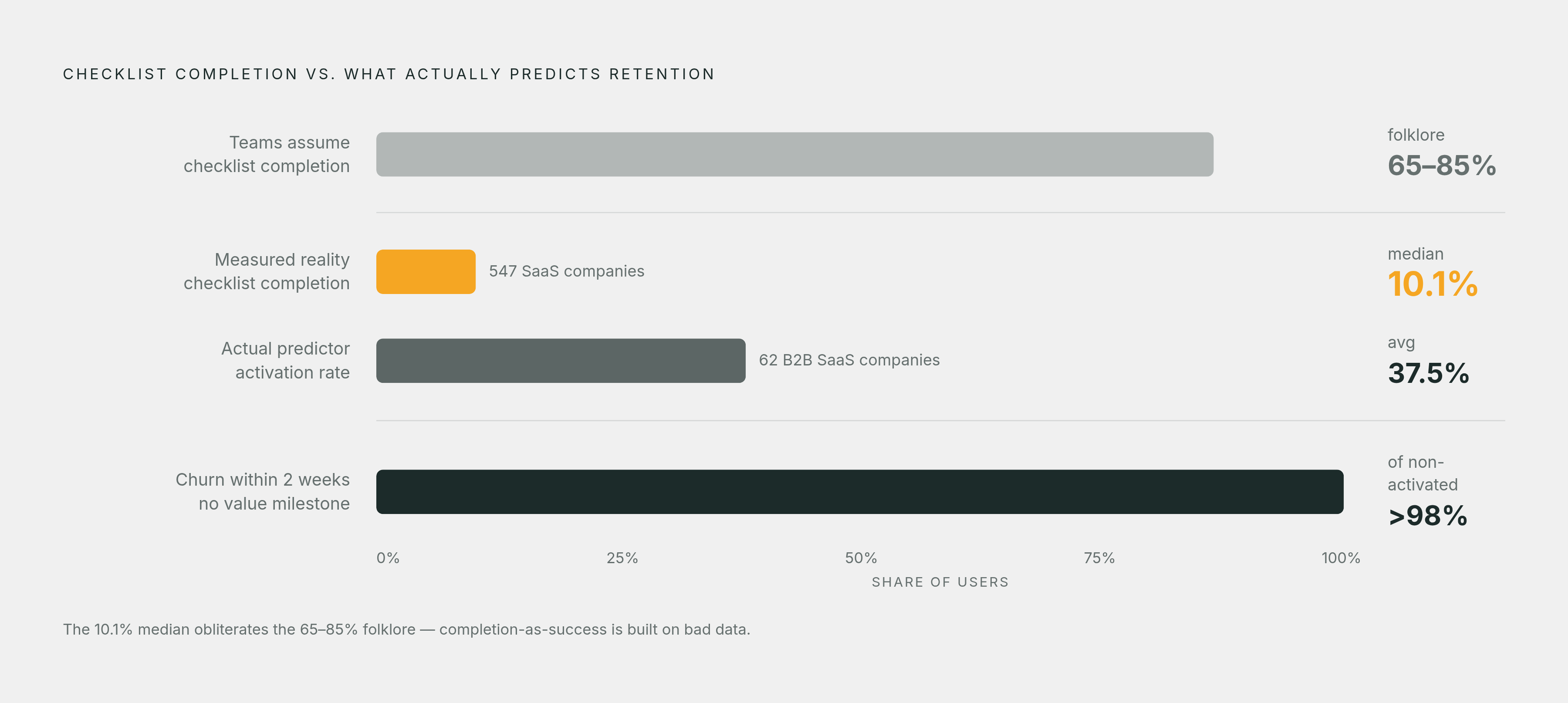
Most SaaS onboarding gets graded on the wrong test. Tours finish, checklists get ticked, completion dashboards glow green, and cohorts still empty out before anyone touches the thing they signed up for. A 2024 benchmark across 62 B2B SaaS companies put average activation at 37.5%, so most people who sign up leave before the product ever does anything for them. That gap, between signing up and getting real value, is the actual problem, and it has nothing to do with acquisition or product quality. It's an onboarding design failure, and it's fixable.
RevenueCat's data on one mobile client showed onboarding completion above 90% on both iOS and Android, and most of those users were gone by day two. That's the trap in one number: a checklist can hit 100% while the user has no idea why the product matters. Completion measures compliance, not value. Separate research covering more than 2,600 companies found over 98% of new users churning within two weeks when they never hit a real value milestone, regardless of how clean the completion numbers looked. Buyers run several tools side by side now, and if one onboarding flow stalls while a competitor's doesn't, the decision gets made by hour 48, not at renewal.
What time-to-value measures, and why it differs from time-to-onboard
Four terms get used interchangeably that shouldn't be, and mixing them up is how teams end up solving the wrong problem. Time to First Value (TTFV) marks the moment a user first experiences something real. Time to Core Value marks when that usage becomes a pattern, the kind that actually predicts renewal. Activation rate is the share of users who ever reach the value event at all, 37.5% on average in that 2024 benchmark. The "aha moment" is the qualitative click, the feeling that the product is worth keeping, and an activation event can only approximate it. It never fully captures it.
A 2025 benchmark spanning 547 SaaS companies put median time-to-value at roughly 1 day, 12 hours, 23 minutes. Treat that as a reference point rather than a target: medians swing wildly by category, and a project management tool's TTV has little to say about a CRM's. That same dataset found onboarding checklist completion averaging just 19.2%, with a median of 10.1%, nowhere close to the 65 to 85% figures that circulate in onboarding blog posts. Whenever a claimed number and a sourced number disagree by that much, trust the sourced one.
Splitting these metrics apart matters because each one diagnoses a different failure. Activation rate exposes how many people never get there at all, with two-thirds of signups failing to activate hiding comfortably under a healthy signup count. TTV shows where the friction sits along the way. Time to core value tells you whether that first success turns into a habit or fades. A team tracking only completion rate has no way of knowing which of these three problems it actually has, so it keeps polishing a tour nobody needed.
How to find the activation event that predicts retention
An activation event has to earn the title, not just get assumed into place. RevenueCat's framing lays out three tests to run before anyone builds around one. Activated users need to retain meaningfully better than everyone else, and that relationship has to hold across different segments, including the hardest ones to prove, not just the easiest. Improving the event itself needs to move retention, not just correlate with it.
Most candidates fail on inspection. Creating an account, logging in, opening a dashboard, completing a profile, watching a tutorial video: these all show activity. None of them prove value got delivered. The real activation event looks different by category, and it's usually the moment someone does the thing they came to do, not the moment they finish setting up to do it. A CRM's activation event is creating the first opportunity. A project management tool's is creating and assigning the first project. An analytics platform's is connecting data and generating a first report. A collaboration tool's is inviting a teammate and finishing something together. Marketing automation's is launching the first campaign.
Finding it means running cohort analysis across 6 to 12 months of retention data, hunting for the specific behavior that splits people who stick around from people who churn. Behavioral cohorts, grouped by an action taken in the first week or month, isolate onboarding's effect in a way acquisition cohorts can't touch. Cohorts where at least 7% of users activate are in the top quartile of products measured, and 69% of those strong performers were also strong at the three-month mark. Day-7 return rate turned out to be a strong cross-temporal signal in that dataset, one that consistently predicts longer-term retention outcomes.
Once the activation event is locked in, the design job gets simpler: build the onboarding flow backward from it. Every step that doesn't move a user toward that event is a candidate for deletion.
The gap between signup and activation is longer than it needs to be
Mandatory configuration sitting in front of any visible value is the worst of four recurring friction patterns: empty dashboards, required CSV imports, connector setup that could easily wait. Generic onboarding that ignores role or intent comes second, handing a user chasing one specific outcome the same flow as someone chasing an entirely different one. Third is onboarding treated like a product tour, parading every feature past someone who hasn't succeeded once yet. Fourth is optional steps, a full profile, notification preferences, sitting ahead of the value moment instead of behind it.
Integrations deserve their own callout, because they quietly cause more drop-off than most teams give them credit for. A user who lands on an empty dashboard and has to manually export a CSV, or wait on an engineer to wire up a connection, will often leave before that work ever gets done. Bring a user's existing data into view on day one instead, and activation climbs while early churn falls off. Discoverability is a related but separate failure: one analysis found 68% of adoption failures come down to users never knowing a relevant feature exists, rather than the feature falling short on value. Nobody activates on a feature they never found.
The clock is tighter than most roadmaps assume, too. Users who don't engage meaningfully within the first three days carry a 90% chance of churning, leaving little runway to fix a clunky signup flow. That's not much runway to fix a clunky signup flow.
Designing the onboarding path backward from the activation event
The method is straightforward, even if executing it isn't: map every step a user genuinely needs to reach the activation event, then interrogate everything else. Can it be removed? Defaulted? Pushed to later? Defaults beat choices whenever the choice doesn't move someone closer to value, and templates beat blank screens, because reacting to something is easier than building from nothing. Required setup belongs before optional configuration, never after, and a demonstrable outcome belongs before a feature explanation, never the other way around.
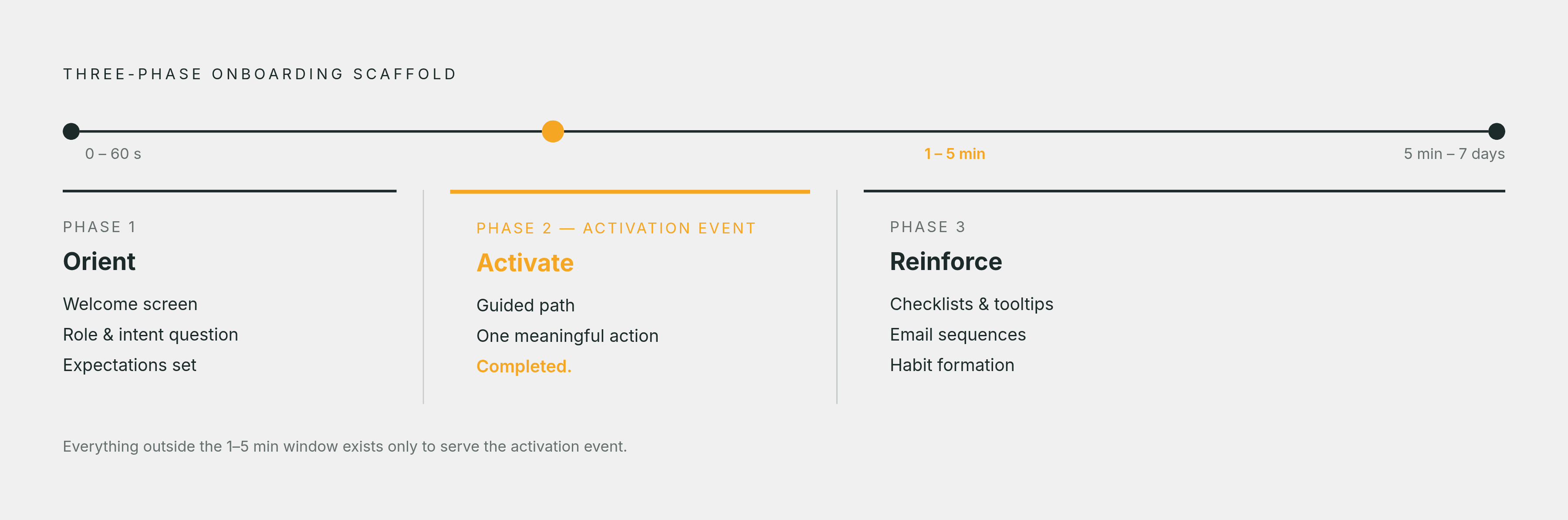
One structural scaffold splits onboarding into three phases. Orient covers the first 0 to 60 seconds, including a welcome screen, a role or intent question, and a quick set of expectations. Activate covers the next 1 to 5 minutes, a guided path toward one meaningful action, completed, nothing more. Reinforce spans 5 minutes out to 7 days: checklists, tooltips, and email sequences that build habits around the features that actually matter.
A few real design choices show the logic in action. Slack puts team invitation front and center, because the product delivers zero value until a second person joins the conversation. Notion asks what someone plans to use it for, then shapes the entire flow around that single answer. Canva orients users toward creation early, prioritizing a path to a finished output over lengthy configuration. These are design decisions to study, not case studies with reported outcomes attached.
Checklists belong in the reinforce phase, not before it, and they should stay short. With average completion at 19.2%, a long, ambitious checklist mostly just sits there half-finished, guilting nobody into action. Order it toward the activation event and stop.
Personalizing the path by role and intent without multiplying maintenance burden
Backward design gets a team most of the way there, but it assumes one path for one kind of user, and most products don't get that luxury. The fix is routing each person to a relevant first workflow based on what they've told you (role, use case, industry, plan) or what their early behavior already implies.
The branching doesn't need to be elaborate, and it shouldn't be. A handful of paths tied to the highest-value use cases makes the experience meaningfully more relevant. The goal is a few good routes, not dozens of bespoke ones somebody has to maintain forever. A 2024 to 2025 benchmark study found role- or use-case-based flows lifting activation by 30 to 50%, with personalization triggered by signup intent improving 7-day retention by 35%. A published case study from Mention found that shortening a signup form using firmographic enrichment lifted signup conversion by 54%.
Keep the intent-capture survey to 2 or 3 questions, full stop. Anything longer adds friction before a single ounce of value has been delivered, which defeats the entire point of asking. Users who complete a relevant integration during onboarding show substantially higher 7-day retention than those who skip it. Connect a user's existing tools early, and the first thing they see is their own real data, not some sample dataset that means nothing to them.
Moving from time-based drips to behavior-grounded guidance
Role and intent branching happens once, at signup. What happens after that is a separate problem, and most teams default to time-based drip sequences: the same email on day 3 for everyone, the same nudge on day 7 no matter what anyone actually did. That's a bet that every user needs the same thing at the same moment. It's usually the wrong bet.
Behavior-triggered sequences respond to what a specific person has actually done, and the gap in results isn't small. Behavior-triggered onboarding shows 30% higher conversion and substantially higher engagement than time-based drips, and behavioral trigger emails generate several times higher click-through rates than time-based equivalents in SaaS onboarding sequences. A trigger only earns its keep when it connects a real gap between what a user's profile says (role, plan, configuration) and what they've actually done in the product. A trigger that just fires on login is a drip campaign wearing a disguise.
Getting there requires plumbing most teams underestimate. A user profile store holds both reported and inferred attributes, fast enough to query from inside the product itself. An event stream publishes user actions to a topic an onboarding rules engine can subscribe to. A rules engine maps event patterns to nudges, suppresses messages already sent, and respects quiet hours so nobody gets pinged at 2 a.m. And an experimentation framework runs every personalization rule against an unpersonalized control group, because without that comparison there's no way to know if any of it works.
That plumbing has a longer arc: teams instrumenting event data for triggers now are building the exact foundation needed to layer AI-generated, behavior-grounded messaging on top of it later. Teams instrumenting event data for triggers now are building the exact foundation needed to layer AI-generated, behavior-grounded messaging on top of it later. Teams that never wired up events will have nothing for a model to personalize against, no matter how good that model eventually gets. That's a reason to build the plumbing today; it isn't a promise about what tomorrow's plumbing will do on its own.
Behavioral signals power expansion too, not just retention: users approaching plan limits, invite patterns suggesting a growing team, feature usage that maps to a higher tier. Each one makes an upgrade prompt feel timely instead of premature. One emerging pattern pushes this further still. Instead of a rules engine firing the same playbook at everyone who matches a condition, an agent investigates each eligible person individually, writes a grounded, specific message when the evidence actually supports it, and says nothing when it doesn't. Prescriptive instead of descriptive. Personal instead of broadcast.
Measuring feature adoption correctly: eligible cohorts and repeated success
Feature adoption rate looks like a single number, but it hides four separate decisions: who could have adopted the feature (the eligible population), what counts as adoption, whether the count is users or accounts, and how much time they get to act. The correct formula is distinct eligible users or accounts reaching meaningful use, divided by distinct eligible users or accounts in that same window, times 100. Use the entire user base as the denominator when only a slice of them even has access to the feature, and the resulting number isn't just wrong, it's actively misleading.
Customers who adopt three or more core features within their first 60 days show net revenue retention roughly double that of customers stuck in surface-level usage, a gap rooted in switching costs, budget justification, and internal champions rather than the quality of the users themselves. That's not because heavy users are simply better people. Deep adoption builds switching costs, justifies the budget line, and creates internal champions who fight to keep the tool around when renewal season comes up. Users who engage with new features within their first week show substantially higher 6-month retention than users who don't discover those features until 30 days in or later.
One example makes the stakes concrete. An enterprise HR and workforce platform generating $45M in ARR across 280 accounts found that only 12% of users were actively engaging with its AI workforce planning module, a gap representing an estimated $4.2M in missed expansion revenue. That gap sat invisible until someone finally measured adoption against the eligible population instead of the total user base.
A workable dashboard pulls one metric from each layer of the funnel. Activation rate checks whether users are reaching that first value milestone. Median plus P75 time-to-value shows how much friction sits between signup and that milestone, and the P75 number specifically is what reveals where the slowest quarter of users actually gets stuck, which the median alone will always hide.