User Onboarding Flows for B2B SaaS
Most B2B SaaS onboarding fails because teams optimize for completion, not actual value.

Only 37% of new users in B2B SaaS ever reach the point where the product does something for them, according to a 2024 benchmark spanning 62 companies. For every ten signups a sales team celebrates, roughly six will vanish having never touched core value. They won't file a support ticket or complain on a review site. They just won't come back, and the CRM will keep calling them "customers" for a quarter or two before finance notices the logo attrition line.
For a small customer success team, the highest-leverage decisions are: lock the activation milestone before designing any screen, keep the onboarding flow to 3 to 5 steps tied directly to that milestone, and replace generic product tours with role-branched paths built from signals collected at signup. Behaviorally triggered emails and tooltips, firing when a user's actual activity signals readiness rather than on a fixed calendar, generate 15 to 25% engagement against the 1 to 3% a broadcast sequence produces, which means a lean team extends its reach without adding headcount. Tracking at the account level, not just the individual user level, matters too: B2B products that build activation strategy around the account report net revenue retention 40 to 70% higher than those optimizing for individual users alone, and that gap is large enough to reorganize an entire onboarding roadmap around.
Value has a shelf life, and most onboarding flows let it expire before the user ever tastes it. A 2025 study spanning more than 2,600 companies found that upwards of 98% of new users churn within two weeks if they haven't hit a real value milestone in that window. Sit with that number, because it means the fight for a customer's attention is mostly over before most teams even start measuring it.
What makes this hard to catch is that the dashboards often look fine. Onboarding completion, tour-finished events, checklist ticks: these metrics can sit north of 90% while the underlying cohort quietly empties out. One subscription app documented completion rates above 90% on both iOS and Android, and most of those same users had churned by day two. Finishing a tour and experiencing value are not the same event, and a flow that optimizes for the former will keep producing tidy reports right up until the revenue numbers force a harder conversation.
None of this points to an acquisition problem or a product-quality problem. It points to a structural one: most onboarding flows are built to get users to the end of a sequence, not to the moment the product proves its worth. What follows is the sequence of design decisions, from how activation gets defined to how accounts (not just individuals) get tracked, that separates a median activation flow from a top-performing one.
Defining activation precisely before designing anything
Activation isn't a status a user drifts into. It's a specific, observable action, one a team can point to and say plainly: users who do this retain, users who don't, don't. Anything softer than that is a vanity metric wearing an activation costume, and most teams are still measuring the costume.
RevenueCat's framing, cited in the Digital Applied methodology, sets a three-part test for whether an event deserves to be called activation. Users who complete it need to retain meaningfully better than users who don't, and that gap has to hold up across segments, not just in a blended, aggregate view where one strong cohort masks three weak ones. Most teams skip the third test: improving the event has to actually move retention. If a team doubles the completion rate of some milestone and retention doesn't budge, that milestone was never activation. It was a compliance checkbox with better branding.
In practice, this means retiring vague milestones for specific ones. Not "completed onboarding," but "created and shared one project." Not "watched the tour," but "sent 2,000 messages in a workspace." Not "signed up," but "closed one ticket with the AI agent." The difference between these pairs isn't stylistic. The first version in each pair can be gamed by a UI designer with a progress bar. The second version can only be gamed by the product actually working, which is a much harder thing to fake.
It helps to separate the layers that get conflated under the umbrella term "onboarding." Time to First Value (TTFV) is the moment a user first perceives that the product is doing something for them. Time to Core Value sits further out: the point at which usage becomes a pattern rather than a one-off, and that pattern is what predicts renewal. Activation rate is simply the share of users who cross the validated activation threshold. Underneath all of it sits the "aha moment," the qualitative click a user experiences that the activation event tries to approximate with something measurable. A 2024 report covering 547 SaaS companies put average time-to-value at 1 day, 12 hours, and 23 minutes. Treat that as a baseline, not the target: products racing toward the top quartile work to compress this well below that average.
The sequencing matters as much as the definition. Lock the activation milestone in before a single onboarding screen gets designed, because every subsequent decision, every button, every email, every empty state, exists to serve that one target. Flows that try to introduce three or four "aha moments" at once tend to produce none. Pick one event. Build the whole flow around it.
The three metrics that tell you whether the flow is working
Three numbers carry the weight here: activation rate, time-to-first-value, and feature adoption rate. Everything else is a supporting statistic, and teams tracking a dozen onboarding metrics are usually avoiding a decision about which three actually matter.
Time-to-first-value deserves particular attention because it moves early. Rising TTV is a leading indicator worth watching closely, since it tends to surface problems earlier than downstream metrics like churn or adoption. A team watching only churn is watching a lagging indicator. A team watching TTV is watching the leading one, and the gap between those two vantage points is often the gap between catching a broken flow in week two versus discovering it in the quarterly business review.
Measurement discipline matters as much as metric selection. Cohort-level tracking, not aggregate dashboards, isolates what an actual flow change did. Blend three months of signups into one number and a change made in week two gets buried under noise from weeks one and three.
Feature adoption rate is where the math most often goes wrong, usually in the denominator. The formula is straightforward: users actively using a feature divided by users eligible to use it, times 100. The eligibility qualifier is not optional. If a feature sits behind a paid plan or applies only to admin roles, measuring adoption against the entire user base manufactures an artificially low number and points a team at a problem that doesn't exist. Other errors compound the distortion: counting page views as "usage," running "ever used" charts that can't show decay over time, or mixing a brand-new launch cohort in with mature, long-tenured users. A benchmark across 181 companies put average core feature adoption at 24.5%, meaning fewer than one in four active users fully engages with the functionality the product is actually sold on. That figure is itself a diagnostic: plenty of users are crossing the activation line without ever building a real habit around the product.
The revenue case closes the loop. A 25% improvement in activation rate correlates with a 34% increase in MRR. That's not a UX statistic, it's a forecasting input, and it's the reason the measurement framework needs to exist before the flow gets built, not after.
How role branching at signup determines what the next five minutes look like
Generic product tours, the kind that walk every signup through the same seven screens regardless of who they are, complete at a median around 15% and don't meaningfully predict conversion, per a 2026 SaaS onboarding benchmarks guide. That bar clears almost nothing. Any team still shipping a single universal tour in 2026 is choosing to leave retention on the table, and there's no version of "we'll fix it later" that makes that choice defensible.
A designer, an admin, and a developer signing up for the same product are not trying to do the same thing in their first five minutes. Showing them the same five minutes is a design failure baked in at signup. The fix replaces the universal tour with segment-specific paths, built from signals collected at signup: self-reported role, company size, integration intent, and the use case a user describes in a short welcome survey. Personalizing the path by role or intent lifts seven-day retention by roughly 35%, according to the same benchmarking work, and separate research on personalized onboarding puts the lift at 40% against generic flows. Role-based onboarding has been associated with meaningful activation gains over uniform flows.
The failure mode worth designing against isn't the absence of a welcome survey. It's the survey being trusted forever. A user checks "I'm a marketer" on day one, gets routed into a marketing-flavored path, and the product keeps treating them as a marketer for the rest of their lifecycle even after their actual behavior diverges completely. Signup-day data doesn't age well, and a fixed path built entirely on a self-reported answer has no mechanism to notice when reality departs from the label.
The correct architecture treats the signup answer as a hypothesis, not a permanent classification. Role branching sets the starting path, but behavioral signals need the authority to override or extend it as real activity accumulates. A marketer who starts building integrations should get routed toward a developer-adjacent flow, survey answer notwithstanding.
Friction removal between the branch point and the activation event
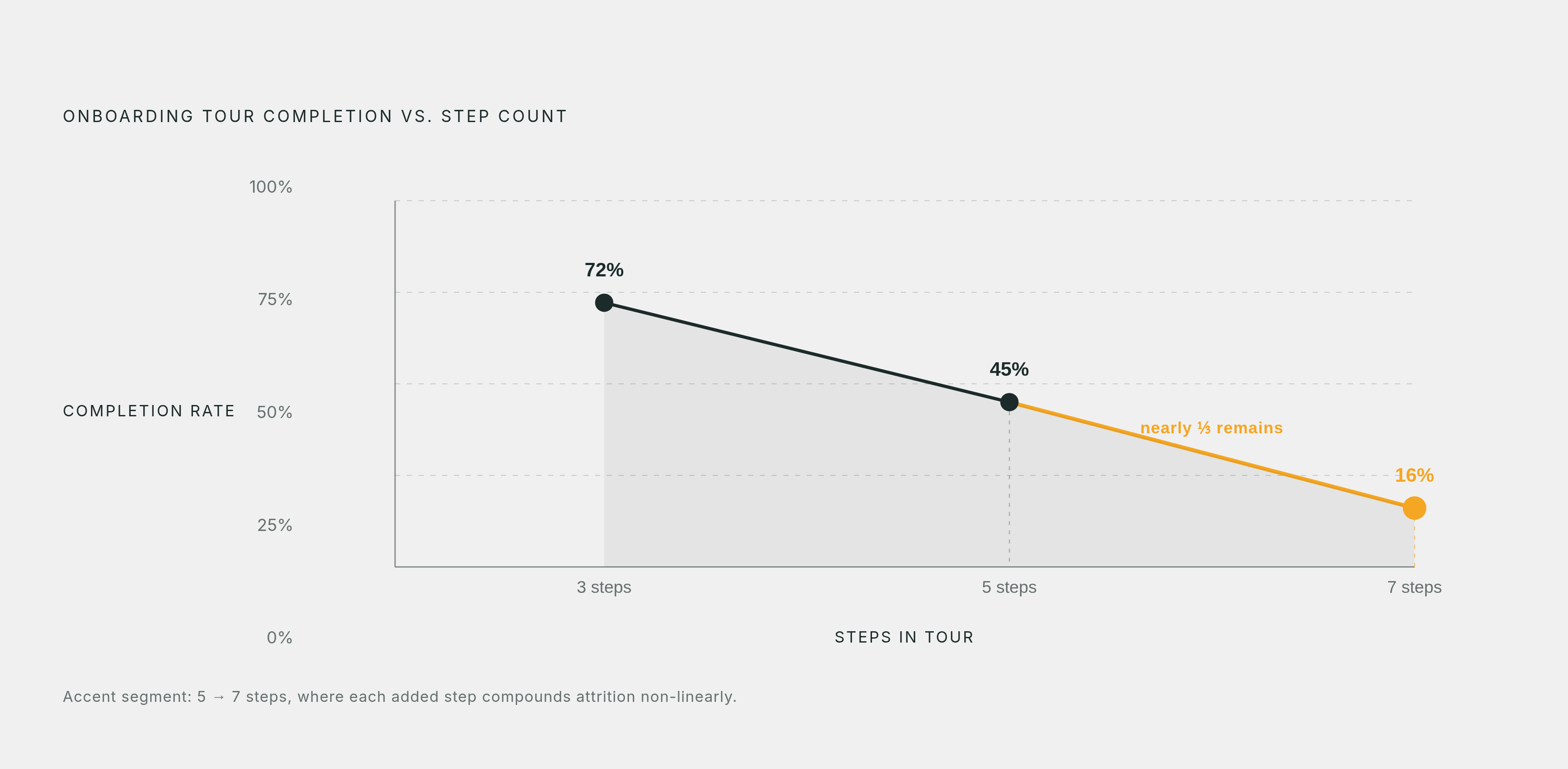
Step count kills completion, and it does so faster than most teams expect. Benchmark data on product tours shows roughly 72% completion at three steps, dropping to about 45% at five steps, and collapsing to around 16% at seven. Each additional step isn't a linear cost, it's compounding, and by step seven the flow has lost the vast majority of the people who started it. Anyone still designing a nine-step onboarding sequence is fighting a curve that doesn't bend back.
Every step that doesn't directly move a user closer to the activation event is a step actively working against the flow. Cut it. The working ceiling sits at 3 to 5 steps tied directly to the activation event, with a target of delivering first value within five minutes and completing the actual activation event as early in the first session as the product allows.
A short audit surfaces most of the offenders. Extra form fields collected at signup that aren't needed to reach activation. Decisions presented to a user before they have the context to make them sensibly. Feature introductions scheduled on a timer (day three, day seven) instead of triggered by what the user has actually done. And empty states, the blank project, the blank inbox, the blank dashboard, that greet a new user with nothing instead of a single obvious next action.
Progressive disclosure is the organizing principle underneath all of this: show fewer choices early, and introduce secondary or advanced functionality only once core value has landed. Adoption timelines back this up. Core features reach meaningful adoption fastest, secondary and advanced features take progressively longer, and optional tools tend to trail well into the product's lifecycle. Trying to introduce a secondary feature in week one is trying to rush a curve that doesn't rush.
Empty states specifically deserve reclassification. They're not neutral waiting rooms, they're activation moments in disguise, and a guided empty state, one that shows a single clear action instead of a blank canvas, measurably outperforms the alternative and reduces early churn. The first empty state a new user encounters should point at exactly one thing: the action that leads to the activation event, nothing else competing for attention.
Interactive walkthroughs, where the user does the thing rather than reads about the thing, consistently outperform static tutorials for retention of the material. Progress indicators, checklists showing how close a user is to a specific milestone, raise completion by 20 to 30%, provided they're scoped to the activation goal itself rather than turned into an inventory of every feature the product happens to offer.
What happens in the five minutes that decide whether the user returns
Five minutes isn't a round number chosen for tidiness. It tracks the window before first-session attention degrades and the browser tab quietly closes for good, and the strongest self-serve products treat that window as a hard constraint, not a suggestion.
That window splits into two phases. The first, call it Orient, covers roughly the first sixty seconds: a welcome, confirmation of role or intent, a plain statement of what's about to happen. The job here is narrow. Eliminate ambiguity about what comes next, and route the user onto the segmented path already established at signup. This is not the moment to sell the product's breadth. It's the moment to remove doubt about the next click.
The second phase, Activate, runs from roughly minute one to minute five. This is the interactive walkthrough to the first value moment, ending with the user completing one meaningful action, the activation event itself. Nothing else in that session matters as much. A feature announcement, a pricing upsell, a "did you know" tooltip, all of it is noise competing against the one thing the session exists to accomplish.
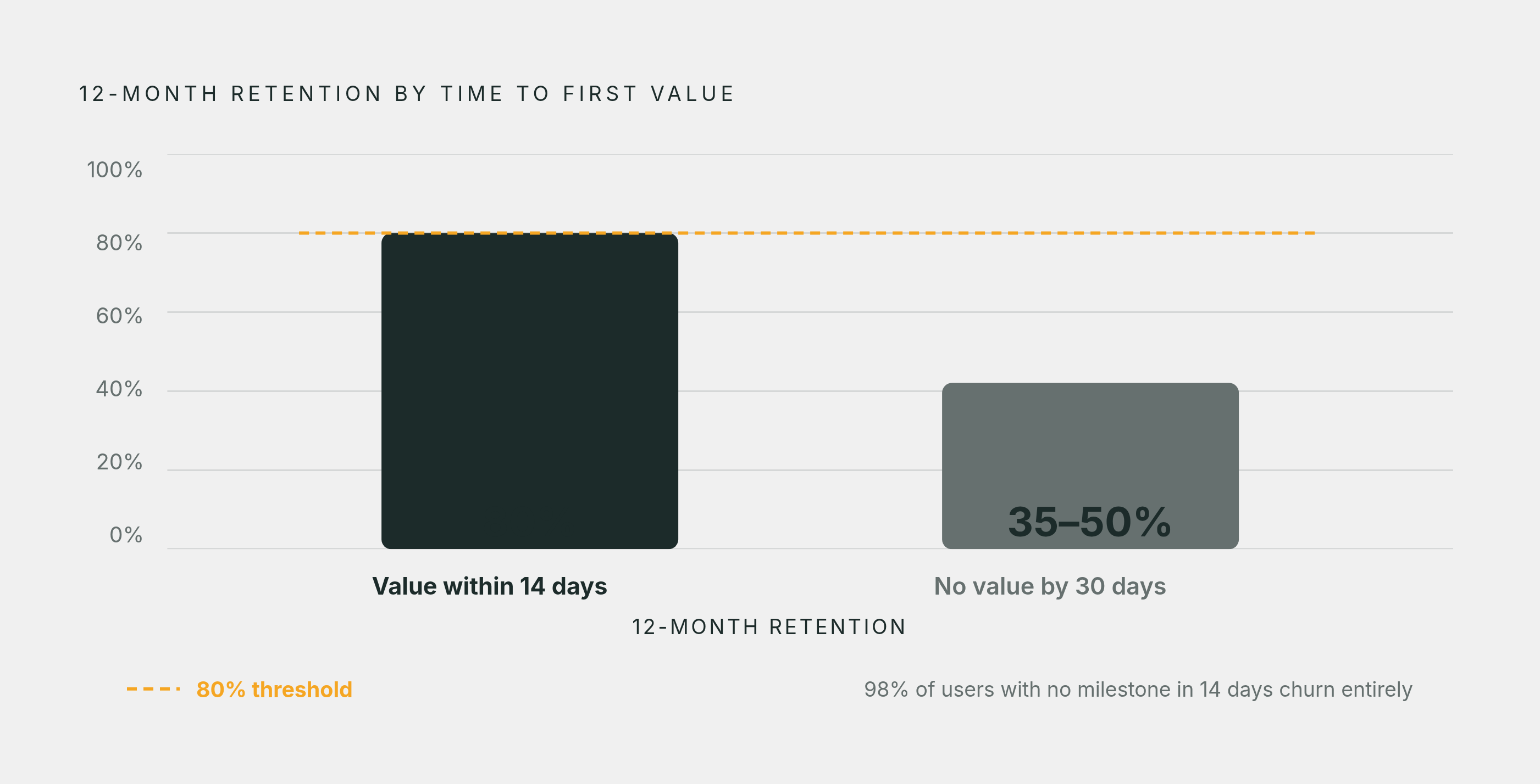
One widely cited retention framework holds that when at least 7% of a cohort returns on day seven, the product sits in the top quartile for retention overall, and roughly 69% of the companies that hit that day-seven bar were also strong performers three months out. Early return is a strong predictor of long-run retention in that dataset, a more reliable signal than most teams give it credit for. Separate benchmarking found that customers hitting first value within 14 days retain above 80% at the twelve-month mark, while those who miss a 30-day window retain at just 35 to 50%.
The design implication is uncomfortable for teams that like adding things. Every second between signup and the activation event is a decision about what to remove, not what to layer on top.
Post-activation reinforcement: building the habit that makes activation durable
High activation paired with low feature adoption is a specific and diagnosable pattern: the flow gets users across a surface-level finish line without building the habit that keeps them there afterward. The gap between a median activation rate and a 24.5% core feature adoption rate is exactly this pattern showing up in the aggregate data. Plenty of users technically activate. Fewer of them ever build a real routine around the product.
The period from five minutes to seven days after activation, call it the Reinforce phase, is where that habit gets built or doesn't. The mechanics that work share a common trait: they respond to what a user actually did, not to a calendar. Visible checklists that surface the next meaningful action, rather than a comprehensive tour of every feature the product owns. Contextual tooltips triggered by specific in-product behavior. Emails that fire only when a user's behavior signals they're ready for the next step, rather than landing on day three because day three was when the campaign was scheduled to send.
The gap between behaviorally triggered and generically scheduled communication is not subtle. Generic email blasts sent to the whole cohort tend to generate 1 to 3% engagement, while personalized messages triggered by actual behavior generate 15 to 25%. That order-of-magnitude difference has nothing to do with copywriting and everything to do with timing. The same logic applies to recovery: behaviorally triggered re-engagement campaigns can recapture 15 to 25% of users who dropped off mid-onboarding, a cohort most flows write off entirely.
Adoption research offers a useful diagnostic here too. Roughly 68% of feature adoption failures trace back to discoverability, not to the feature lacking value. Users don't ignore a feature because it's weak. They ignore it because they never encountered it at a moment when it was relevant to what they were doing. Reinforcement that surfaces the right feature at the right behavioral moment addresses the dominant failure mode directly, instead of chasing feature-quality problems that mostly don't exist.
Adoption is repeated use, and it moves through distinct stages: awareness, trial, activation, repeat usage, and eventually habit. Each stage calls for a different kind of nudge, and treating them as one undifferentiated blob is how reinforcement campaigns end up generic. The payoff for getting this right compounds: a 1% lift in activation correlates with roughly a 2% reduction in churn, according to 2026 industry data. Reinforcement work isn't a UX nicety tacked onto the end of a project. It's a revenue lever with a fairly direct multiplier attached.
Why do individual user metrics miss half the picture for B2B onboarding?
Everything above describes what happens to one person. In B2B SaaS, that's only half the story, and treating it as the whole story is where otherwise well-built onboarding flows quietly stall out at the account level.
An individual crossing the activation threshold doesn't mean the account they belong to is activated. An account activates when a critical mass of the right roles and the right users have taken up the product together, a fundamentally different bar than any single user hitting a milestone. A power user who has built their whole workflow around a tool can still churn if nobody else on their team ever logged in, because renewal decisions at the account level get made by people looking at usage across the whole account, not one enthusiastic individual.
The practical fix is to track both levels and keep them distinct rather than folding one into the other. Individual-level activation asks whether a given person reached their validated activation event. Account-level activation asks whether the right combination of roles and users has adopted the product deeply enough that it's actually embedded in how the account works day to day. A product can post strong numbers on the first measure and weak numbers on the second, and that exact combination is the profile of an account quietly heading toward non-renewal.
B2B products that build their activation strategy around the account, rather than around individual users in isolation, report net revenue retention 40 to 70% higher than products optimizing for individual activation alone. That gap is large enough to reorganize an onboarding roadmap around. Successful team-level activation, not a date on a calendar, should trigger expansion conversations: introducing additional features, proposing more seats, or opening an upsell discussion. Timing expansion off adoption evidence rather than off a renewal date turns an account motion into something closer to a diagnosis than a sales script.