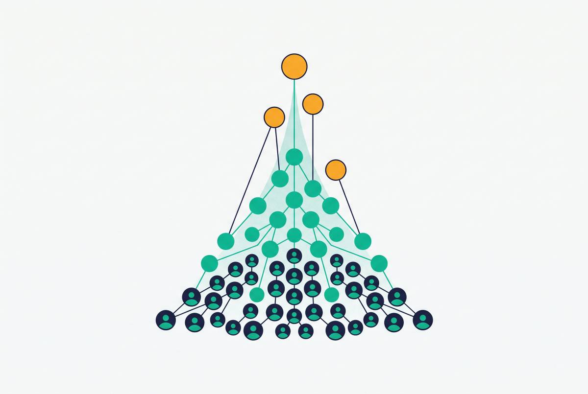
Activation Milestone Mapping for New SaaS Products
Measure activation by what retained users did that churned users didn't.
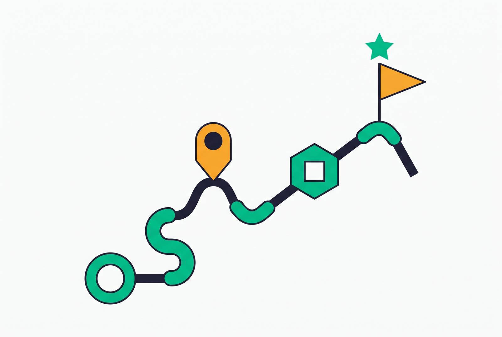
A milestone worth tracking names three things: the specific action, the context around it, and the reason that action signals value rather than idle clicking. "User completes profile" fails all three tests, because it measures effort, and effort is cheap. Compare that to "user books their first appointment" for scheduling software, "user creates their first workspace with at least one collaborator" for a project management tool, or "user runs their first query against live data" for a BI product. Each of those describes something a user does because the product already works for them, separate from any onboarding wizard nudging the action along.
Here is a test worth applying to any candidate behavior: would it look meaningfully different from zero if the user never opened the product again? Booking an appointment clears that bar; browsing a calendar screen doesn't. Running a query against live data clears it; clicking through a sample dashboard doesn't. Profile completion never clears it, since it happened once and predicts nothing about tomorrow. Most teams that keep it on the dashboard are measuring comfort rather than value, and it should be cut outright, not reweighted or downgraded to a secondary metric.
Activation milestones cannot be borrowed from a competitor's playbook, and this is where a lot of teams go wrong from the start. Lift someone else's definition and the resulting dashboard tracks their product, not yours; a milestone that predicts retention for a scheduling tool says nothing about a BI product, because the value delivered underneath differs in kind, not just in degree. The only reliable method is studying what paying, retained users actually did in their first sessions that churned users did not do. That is a company-specific exercise with no universal answer, and teams that skip it in favor of an industry benchmark end up optimizing for a number that was never theirs to chase. Precision on day one matters less than consistency: track a specific, named combination of events long enough to revisit and refine it later. Activation rate is a choice a team makes about which behaviors it holds itself accountable to, revisited and refined as evidence accumulates rather than fixed in place from the start.
How to find your real activation milestone by working backward from retained users
The reliable method runs backward. Pull the earliest behavioral sequences of two groups: users who retained and expanded, and users who churned inside the first few weeks. Somewhere in those sequences sits a divergence, an action or combination of actions that shows up disproportionately in the retained group and rarely in the churned one. That divergence is the activation signal, and it is almost always narrower than teams expect going in.
Depth matters as much as breadth, and this is where most teams get lazy. It is rarely enough that a user did the thing once; the real signal often lives in how they did it. Running a query against a demo dataset is not the same behavior as running one against live, connected data. Creating a workspace alone is not the same as creating one with a second person already inside it. The version involving real stakes, real data, or another human being is usually the version that predicts retention, and teams that skip this distinction end up crediting the wrong step, then wondering why the milestone stops predicting anything six months later.
Two traps distort this analysis if left unchecked. One is correlation mistaken for causation: a step that shows up heavily among retained users may sit downstream of retention rather than causing it, something people who were already staying happened to do along the way. Survivorship bias is the other trap. Exclude or underweight the churned population, and the resulting picture skews toward the habits of people who would have stuck around regardless of any milestone. Both cohorts need to sit in the dataset explicitly, or the comparison means nothing.
Once a candidate milestone surfaces, it needs a check against real conversation, not more dashboard slicing. Talking to recently activated users about the moment the product "clicked" validates or kills the hypothesis fast, in a way a chart alone cannot. The output should stay narrow: a small, specific set of behavioral events, rarely more than two or three, that the team commits to as the working definition of activation.
Sequencing milestones so each one sets up the next behavior, not just the next screen
A milestone map gets built as a linear checklist far too often, and that habit is the mistake worth naming directly. Treat activation as a list of boxes to check in order, and the map stops describing anything real. The better model represents how value compounds: first value attainment, then habit formation, then depth of use, then a signal of expansion. Each stage should make the next behavior feel obvious rather than instructed. If reaching one milestone does not change what a user is inclined to do next, the sequencing is broken, no matter how clean the checklist looks in a dashboard.
B2B products complicate this because different roles reach different milestones on different timelines, and pretending otherwise is where most milestone maps quietly fall apart. An individual contributor might hit a "first output" milestone alone, entirely within their own session. A team expansion milestone, by definition, needs a second person to show up and take an action, which depends on someone else's calendar and interest rather than the first user's momentum. An admin's or buyer's milestone might lag weeks behind the individual contributor's first activation, since procurement runs on its own clock. One sequence cannot account for all three timelines at once; forcing it usually just buries the real signal under an average.
The onboarding checklist, used well, remains a sequencing tool worth keeping. The distinction is that each item on it has to be a behavior, not a form field, and completing one item should visibly close the distance to the next meaningful outcome. Segmenting by role matters here too: a product manager and a developer signing up for the same tool are not walking the same path toward value, and forcing them through an identical sequence just delays the moment either one gets something real. Role-segmented onboarding gets each user to their own first-value moment faster, and the milestones after that point can deepen the specific type of value that role cares about, instead of pushing generic exploration on everyone equally.
Treating each milestone as a trigger for a specific, measurable next action
Two mindsets produce very different outcomes here, and only one holds up. The checkbox mindset treats a milestone as an event to log: reached, marked complete, moved past, with no feedback loop and no follow-through, just a record that something happened. The trigger mindset treats the same milestone as information, because the behavioral signal tells the team exactly what the user is ready for next. That guidance should arrive now, while the readiness exists, rather than on a fixed schedule three days later.
In practice, "next action" takes a few shapes. It can be an in-app prompt that surfaces an adjacent feature while the user is already working in the relevant part of the product. A message can name the specific thing the user just did: "you just ran your first report, here's how to share it with your team," rather than a generic nudge about features they have not touched. Sometimes the right next action is none at all. If a user is already moving toward the next milestone unprompted, an intervention at that moment is just noise competing for attention it does not need.
Timing does most of the work in separating guidance from interruption. A feature introduction delivered while a user is actively working in a related part of the product outperforms the identical message dropped at login or into an inbox on a fixed schedule, and it is not a close comparison. Personalization compounds that advantage: "you did X, here's what users who do X next tend to find useful" reaches a user with far more relevance than a broadcast sent to everyone regardless of where they stand in the product. Generic lifecycle emails, fired on a calendar instead of a behavior, fail for exactly this reason. They have no way of knowing where any individual user sits on the milestone map, so they end up speaking to an average user who does not exist.
How in-app guidance outperforms email-only approaches for moving users through milestones
Activation mapping does not stop at the first moment of value. It extends into the feature adoption funnel that follows: exposure, activation of that feature, ongoing usage, and eventually usage repeated enough to become habit. Most features inside most SaaS products never make it past exposure, because users simply never discover them. That points to a sequencing and delivery failure more than to weak feature design, and teams that conflate the two end up killing features that only ever needed better placement.
In-app guidance wins this comparison, and it is not particularly close, because it meets a user in the exact context where the behavior can happen immediately. The distance between learning about a feature and using it shrinks to almost nothing when both happen on the same screen, in the same moment, instead of the feature getting described in an email the user has to remember, find, and try later on their own initiative. Email-only rollout asks the user to do the remembering; in-app guidance does the remembering for them. That gap is bigger than most teams building lifecycle email programs want to admit. Interactive walkthroughs that guide someone through an actual workflow, step by step, produce stronger feature activation than a static release note or a one-time announcement, because a walkthrough asks for action instead of attention.
The stakes connect directly to retention. Accounts that adopt multiple features early in their lifecycle tend to churn less than accounts that settle into using just one. Each additional feature a user picks up works like another thread tying them to the product; losing any single thread matters less when several others are still holding. That has a direct implication for how a milestone map gets built: it needs to extend past the initial activation event into the first two or three feature adoption milestones, each with its own behavioral trigger, rather than stopping once the "aha moment" gets logged. Improving adoption of features that already exist is almost always cheaper and faster than shipping new ones, and a well-built milestone map is what makes that leverage visible in the first place.
When activation behavior crosses the threshold into a product-qualified lead signal
A product-qualified lead is a user, or an account, whose in-product behavior reveals genuine intent to buy or expand, as distinct from a lead qualified on marketing behavior like a whitepaper download or a form fill. The connection to milestone mapping is direct: PQL thresholds are activation milestones read at the account level and weighted for commercial significance. Treating PQL scoring as a separate discipline from activation mapping is a mistake, and it shows up later as two disconnected, half-maintained systems, each guessing at what the other already knows.
Certain behavioral patterns tend to cluster around this threshold. Repeatedly hitting usage or feature limits is one; it signals a user has outgrown the tier they are on. Inviting teammates is another, and in most B2B products, team expansion is one of the strongest intent signals available, since it means the value is being vouched for internally by someone other than the original user. Exploring premium or restricted features is a third signal, and depth of adoption across multiple features within a short window is a fourth. None of these require a survey or a sales call to surface. They are already sitting in the usage logs.
PQLs convert at meaningfully higher rates than leads qualified purely on marketing engagement, and the reason traces to a basic distinction: product usage is a revealed preference, while a form fill is only a stated one. A person's actual behavior inside the product says more about intent than anything they were willing to type into a lead capture field. Building a PQL system without precise activation milestone data underneath it amounts to guessing at thresholds instead of deriving them from evidence, and that guessing is exactly what most PQL scoring models do when they borrow weights from a sales team's intuition instead of the retention cohort analysis. The behavioral cutoffs that define "qualified" should come from the same cohort analysis used to find the activation milestone in the first place. For product-led growth teams, the activation map and the PQL definition are the same underlying behavioral model, read at two different points in the funnel, and they should be maintained together, by one team comparing notes rather than two working in isolation.
Measuring whether a milestone intervention actually changed behavior
Onboarding emails get judged by open rates and click-through rates more often than not, and both numbers are a trap worth naming plainly. They confirm a message got delivered and glanced at, saying nothing about whether the recipient's behavior changed afterward, which is the only thing that actually matters. A high open rate on a feature announcement that nobody then goes and uses amounts to a vanity metric with a professional-looking chart wrapped around it. The only measurement that validates a milestone intervention is whether users who received it reached the next behavioral milestone at a higher rate than they would have otherwise.
A closed feedback loop looks like this: an intervention fires when a user hits milestone N. The team tracks the rate at which those users reach milestone N+1 within a defined window, then compares that rate against a baseline or control cohort that did not get the same intervention. If the rate does not move, something in the chain is wrong, whether that is the milestone definition, the timing of the message, or the content of the guidance itself. The map needs revision at that point, not a shrug and a rerun next quarter.
Activation rate as a single aggregate number hides more than it reveals. It only becomes useful once tracked by cohort over time, because an aggregate can look healthy while masking a milestone map that works fine for the historical user base and does nothing for new signups, or the reverse. AI-driven systems can run this feedback loop at a scale manual review never could: an agent that watches whether behavior actually shifted after each nudge, and adjusts the next round of guidance based on that outcome, operates at scale on the same principle that used to happen by hand with a company's first ten customers, checking in, noticing what worked, adjusting the next conversation accordingly. Goal-driven campaigns, where each intervention carries an explicit behavioral target and the system checks whether that target got hit, treat milestones as triggers rather than checkboxes. Teams that keep measuring behavior change at each step get compounding returns from it: every iteration sharpens the milestone definition and the quality of the intervention together, rather than improving one at the expense of the other.