Onboarding Checklist vs Interactive Walkthrough Tradeoffs
Checklists work best when users understand what to do; walkthroughs when they need to learn how.
What checklists and walkthroughs actually do without other measures in place
Use a checklist when users already understand the tasks in front of them and need a persistent map of what remains, when steps are independently executable without hand-holding, or when someone returns mid-session and needs to re-orient. Use an interactive walkthrough when a user is facing a workflow for the first time and knowing an action exists is not enough, particularly for multi-step sequences where losing your place halfway through means starting over. The core tradeoff is that a checklist hands users agency and breadth but names actions without teaching execution, while a walkthrough teaches by doing but feels coercive to someone who already knows part of the workflow. For users who are partially familiar, a checklist with walkthrough triggers embedded in individual steps handles that overlap best, letting them skip what they already know and pull up guidance only where they actually get stuck.
Checklists and walkthroughs get treated as rival philosophies, and that's the wrong frame. They're instruments, not doctrines. Each one either serves or misses a specific cognitive moment, depending on what the user already knows, what they need to do next, and how hard that next action is. Pick the wrong one for the moment and the result isn't a slightly worse onboarding experience: it's a user who quietly stops trusting the guidance altogether, and starts ignoring every prompt after it, including the ones that would have actually helped.
A checklist is a persistent, visible inventory of what's left to do. It cuts cognitive load by externalizing the remaining steps, so the user isn't holding the whole setup process in working memory. It also hands the user agency: they pick the order, they pick the pace, and every checked box reinforces the sense that progress is measurable.
The detail that makes or breaks a checklist gets overlooked constantly. It should reflect steps a user already completed through some other path. If someone connects an integration from a settings page instead of from the checklist, and the checklist doesn't notice, it just told that user their work doesn't count. Do that once and the list stops being trusted. Its natural limit is that it names actions without teaching execution: a checklist can say "connect your calendar," but a user who doesn't know where that setting lives is on their own.
A walkthrough works differently. It's sequential and action-gated: each step only advances once the user actually clicks, creates, imports, or selects the thing being asked of them. That structure teaches by doing, and it closes the gap between being told what to do and knowing how to do it. Its limit mirrors the checklist's strength: linear guidance can feel coercive to a user who already knows part of the workflow, or who arrived with a specific intent the tour was never built to accommodate.
Neither format finishes the job alone. Treating either as sufficient is the actual mistake teams make here, whichever one they choose to lead with. Checklists map the territory. Walkthroughs move people through the parts of that territory they've never walked before. Used together, the combination lets users extract value from the product in their own context, a different and harder outcome than simply watching a demo run.
Why the completion-rate data is the wrong signal
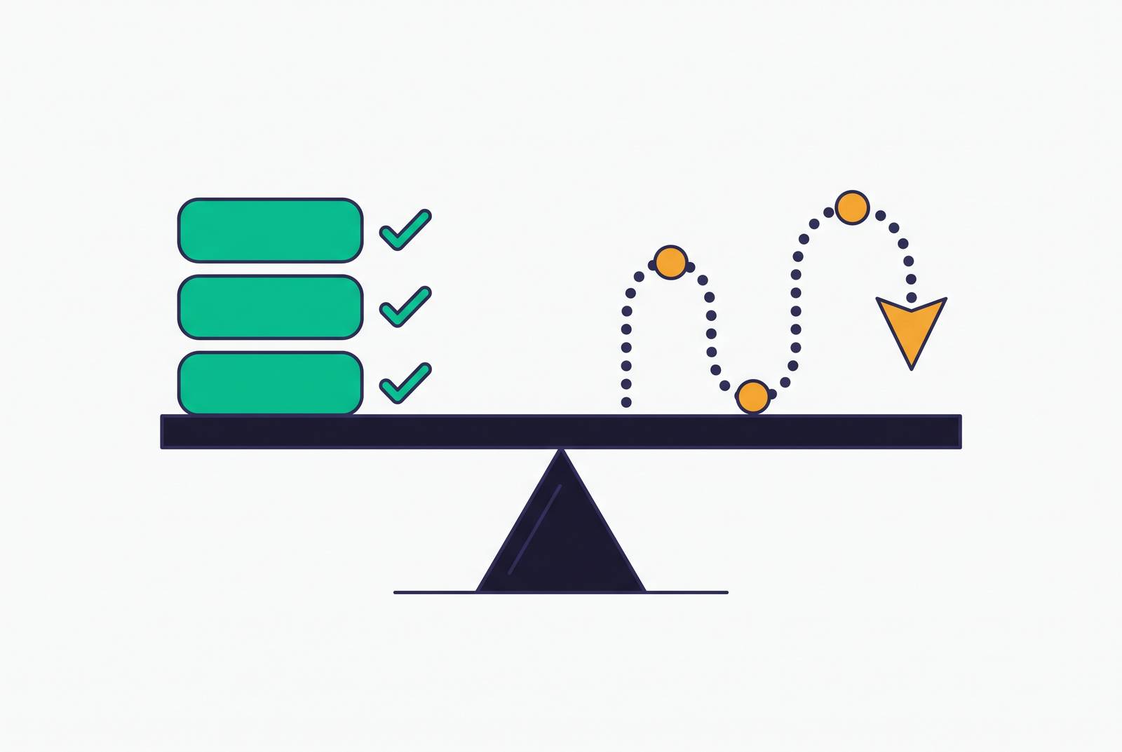
Interactive walkthroughs complete at a much higher rate than checklists do, by a wide margin. Read that fact at face value and you'd conclude walkthroughs win and checklists are broken. That conclusion doesn't survive five minutes of thinking about what completion actually measures.
Completion tracks whether someone clicked through to the end, distinct from whether they performed the activation behavior the format existed to produce. Those are not the same thing, and treating them as interchangeable is the single most common measurement error in onboarding analysis. A checklist that finishes at a low rate but reliably steers the users who touch it toward the activation event beats a walkthrough that finishes near universally and ends with no behavioral change whatsoever. Anyone optimizing for the completion number instead of the behavior that produces it is optimizing for the wrong thing, full stop.
Format performance is a property of whether the format got deployed at the right cognitive moment, not a property of the format itself. That's the question the rest of this piece actually answers.
When should you use a checklist vs an interactive walkthrough?
Three variables decide which format belongs where: what the user already knows about the workflow domain, what action comes next, and how complex that action is. Can you name the action in a checklist label, or does someone need to be walked through it step by step?
A checklist fits when the user understands the tasks in front of them but needs a map of what's left, when the remaining steps are independently executable without in-context hand-holding, or when someone has stepped away mid-session and just needs to re-orient on return. It also fits when the goal is breadth across setup tasks rather than depth in one workflow. Scope should stay narrow here, three to five items tied directly to the activation threshold, rather than turning into a scavenger hunt across every feature the product has.
A walkthrough fits when the user is facing a workflow for the first time and simply knowing an action exists isn't enough. They need to see it executed in context. It fits when the activation event demands a multi-step sequence that's easy to abandon the moment guidance disappears, the kind of sequence where losing your place halfway through means starting over.
The harder case is the overlap zone: users who are partially familiar, who know the general shape of the task but not this particular product's mechanics. A checklist with walkthrough triggers embedded in individual steps handles that zone best, since it lets someone skip what they already know and pull up guidance only where they actually get stuck. Defaulting to a full walkthrough for these users wastes the format. It teaches people things they didn't need taught, and they abandon it halfway through, which is worse than if you'd shown them nothing at all.
A three-phase sequence that shows how the formats hand off to each other
Onboarding built around a single format misses something basic: a user's needs change within the first week, sometimes within the first five minutes. A three-phase structure handles that shift, and skipping a phase is where most flows break down.
Phase one is Orient, covering roughly the first sixty seconds. This is welcome screens, role selection, use-case selection, and nothing resembling feature instruction yet. The goal is confirming the user landed in the right place and pointing them toward their specific activation event. Neither checklist nor walkthrough belongs here. A minimal prompt or an intent question does the job, and adding more than that just delays the moment that actually matters.
Phase two is Activate, spanning roughly the first one to five minutes. This is where the interactive walkthrough belongs, because this is the point of maximum unfamiliarity and maximum stakes: the single action that constitutes activation either happens here or the user churns. The walkthrough should end the second that action completes. It should not keep going to tour features unrelated to the activation event, no matter how proud the product team is of them.
Phase three is Reinforce, running from the five-minute mark through roughly day seven. This is checklist territory, alongside contextual tooltips and behavior-triggered guidance. The checklist here serves a returning user who already knows the product exists and needs a reminder of what's next, staying brief rather than teaching them how to do it. Reinforcement should fire on product events, keyed to what a user has actually done rather than to calendar days. Sending a "day-three tip" to someone who crossed the activation threshold on day one just tells that user the system isn't paying attention.
Most flows that fail skip Activate and Reinforce entirely and jump straight to asking for an upgrade. That's asking someone to pay for a feeling they haven't had yet, and no format choice fixes a sequencing mistake that basic.
The denominator and the trigger matter as much as the format itself
Format choice means nothing if the denominator is wrong. Take a feature that is at 10% overall adoption, which reads as failure until someone asks who actually had access to it. Restrict the count to eligible users only, and the real figure might sit closer to 25%. Segmentation, not the product itself, had been holding the number down the whole time.
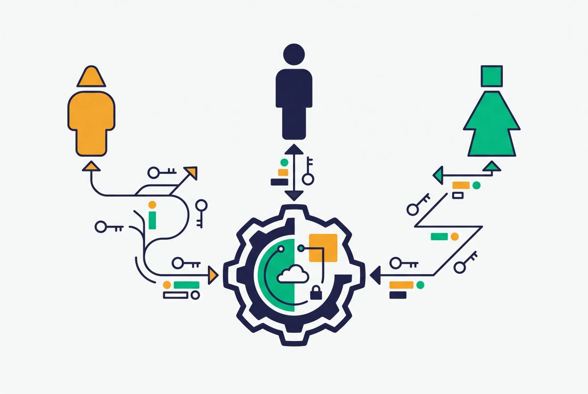
That has a direct consequence for format choice: showing a walkthrough to users who don't hold the plan, role, or permission needed to reach the activation event wastes the interaction. Worse, it teaches those users to dismiss guidance going forward, including guidance that would otherwise help them once they're eligible. For products where access varies by plan, role, or permission, feature adoption should count distinct eligible users who reach meaningful use, divided by distinct eligible users in that same window. Anything looser measures noise, not adoption.
The same eligibility logic applies to timing. A checklist item shouldn't appear for a step someone already finished. A walkthrough shouldn't launch mid-session on a user who arrived with an unrelated task in mind. Firing guidance on product events instead of elapsed time makes a system pay attention rather than just run a script. Knowing a user's role, plan, and current configuration before triggering anything is what makes guidance feel relevant instead of generic. Skip that step, and the best-designed walkthrough in the world reads as spam.
Measuring whether either format moved adoption
Feature adoption describes whether something becomes part of how a user actually works, a deeper measure than whether they clicked through a tour about it. Activity and adoption are genuinely different outcomes, and conflating them is where most measurement efforts go wrong. The gap between the two is exactly where onboarding quietly fails: a user can finish an interactive walkthrough start to end and show no meaningful change in adoption of the feature it was teaching.
A handful of metrics actually close that gap. Activation rate tracks the share of users reaching that first value milestone. Median and P75 time-to-value show how much friction sits between signup and value: the P75 number pinpoints where a flow breaks down for less confident users, capturing the slow tail that the median alone hides. Repeat key-action rate answers whether that first success turns into a habit, and retained adoption by cohort tracks whether the behavior persists into later periods. For B2B accounts specifically, multi-user activation, the share of accounts with two or more active users, flags churn risk even when a single enthusiastic champion makes the account look healthy on paper.
The diagnostic that actually holds up is a cohort comparison: retained adoption for users who went through a walkthrough path, against users who went through a checklist path, against users who got a combined path. Whichever produces durable repeat behavior in the eligible population is the one worth keeping, regardless of which one has the flashier completion screen. Read post-guidance adoption as a leading indicator, since correlation and causal lift are separate claims, and no completion metric proves the second one.
Choose the format by the cognitive moment. Trigger it by eligible context. Measure it by repeated, successful use, never by whether the tour made it to the end.