Empty State Design That Drives First Actions in SaaS
Blank screens decide whether new users ever take action, so design them for the specific moment.
Onboarding emails that trigger on actual product behavior watch for specific events a user does or doesn't complete (first project created, no data source connected, invite sent but not accepted), check account eligibility so messages only reach the right plan or role, fire inside a defined timing window after the triggering event, and report back against activation as the metric that proves whether the sequence worked. The same logic that makes a behavior-based email effective is the logic that makes an empty state effective: both are responses to what a specific user actually did, not a script sent to everyone on day one. Everything that follows explains why that single screen, the one a new user hits before they've done anything at all, decides whether any onboarding sequence downstream ever gets the chance to work.
The empty state: the highest-stakes screen in a SaaS product
Every SaaS product proves its worth through the user's own data, and every new account starts with none. That makes the empty state the actual first impression, ahead of the landing page, the welcome email, and the demo. A new user arrives at this screen having already handed over an email address, maybe a credit card, and their full attention. Motivation is as high as it will ever be, and product knowledge is as low as it will ever be. Most teams spend weeks refining the dashboard a returning user sees, then ship a grey icon and "No items yet" for the one screen every single new user is guaranteed to see first.
A blank screen is not a neutral surface. It reads as an active signal, and the brain treats it as one. SaaSFactor's guide cites Dr. Susan Weinschenk, a behavioral psychologist, who notes that blank spaces trigger mild anxiety, because the brain perceives incompleteness rather than opportunity. A new user doesn't see a canvas. They see something that looks broken, confusing, or not worth their time, and all three readings end the same way: closing the tab. SaaS Factor's research puts a number on how fast that happens: 75% of users abandon a product within the first week if they struggle getting started.
Product-led growth sharpens all of this. There is no account executive walking the user through setup, no customer success manager on a call, no demo guiding attention toward the right feature. The product has to sell itself, and it has minutes, not days, to do it. A user who can't picture what value looks like from an empty screen won't construct that picture on their own. They leave, and the product never gets a second chance at that first impression.
What happens when users hit a bad empty state
Activation loss is the first and largest revenue leak in a SaaS business, and the empty state is where most of that leak opens up. A large share of free users never reach activation at all: they log in once, see a screen with nothing useful on it, and disappear without a word. Every dollar spent acquiring that user is now a sunk cost with no return, because the product never got the chance to demonstrate anything. A thousand signups with no activation produces nothing, no matter how efficient the acquisition funnel that generated them was.
The failure is cognitive, a matter of users being unable to picture the product's value. New users can't picture what the product looks like once it holds real data, so they have no way to picture the value it's supposed to deliver. An empty state's actual job is to close that gap by showing the user the destination instead of an empty starting line. When a screen offers no model of what success looks like and no obvious action to take, a new user faces several uncertainties at once: what this screen is for, what to do next, and whether something has gone wrong. That pile-up of unresolved questions produces the silent exit, and it rarely registers as a complaint. It appears as a login that never happens again.
That silence is part of what makes the problem so hard to catch. A user who churns at the empty state hasn't generated any product data yet, so there's no trail of clicks or events to examine afterward, only the fact of their absence. Diagnosing why activation failed means looking at what one specific user did and didn't do in that moment, the way a founder studies the earliest handful of customers rather than an aggregate dashboard. Account intelligence platforms are built around that same discipline: reading individual account behavior closely enough to see where intention stopped turning into action, rather than relying on a churn rate that only confirms the loss after it has already happened.
Everything measured after activation, expansion, retention, lifetime value, compounds whatever happened at this one moment. Users who activate early carry meaningfully higher lifetime value than those who stall out, so a failed empty state isn't a cosmetic miss, but a multiplier running in the wrong direction, quietly suppressing every metric a SaaS business reports to its board.
The five types of empty state
"Empty state" is not one condition with one correct response. Screens go blank for five distinct reasons, and each one puts the user in a different emotional state. The same design response applied across all five sends the wrong message most of the time. Kompassify's 2026 guide and Pixxen's pattern library converge on the same taxonomy, which suggests the categories are settled rather than a matter of house style.
First-use is the newest account, feature, or workspace, with nothing created yet. The user is curious but unsure of themselves, and the screen's job is to onboard. Cleared or completed is the opposite emotional register: an inbox at zero, a task list fully checked off. The user feels accomplished, and the screen's job is to celebrate that and point toward what comes next, not to apologize for being empty. No-results appears when a search or filter comes back with nothing, leaving the user mildly frustrated, and the right response is to help them refine the query rather than leave them at a dead end. Error states occur when content exists but failed to load, and the user is worried something is broken, so the screen needs to reassure them and offer a retry. Permission states appear when a user's role or plan doesn't grant access, leaving them blocked, and the job there is to explain clearly who can get in and what the path forward looks like.
Most of the damage happens when these tones get swapped. A cheerful "Nothing here yet" shown to someone who just cleared their entire task list turns an accomplishment into something that sounds like an apology. A paywall is a reasonable thing to show inside a permission-based empty state, but showing it to a brand-new user before they've seen any value at all gives them a reason to bounce before they've started. Empty screens appear for five different reasons, each placing the user in a different emotional state, and showing the same design response to all of them produces the wrong message every time. The other four types can be refined over many iterations. First-use only gets one shot per user. The rest of this piece stays focused there.
The four components every first-use empty state must have
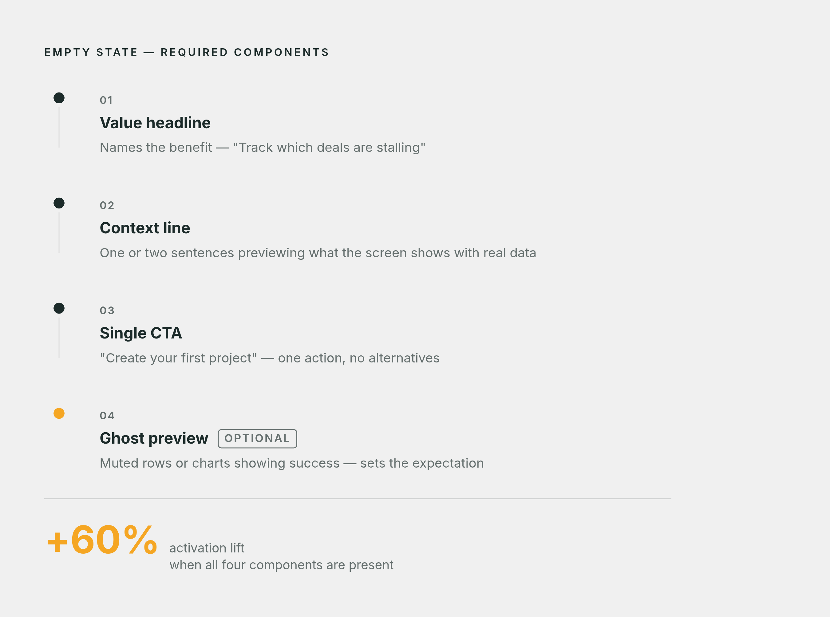
A first-use empty state has four jobs, and they need to happen in order. Skipping any one of them is where most implementations break down: well-built empty states boost activation by roughly 60%, according to SaaS Factor's research.
1. A headline that names the value
The headline should describe the outcome. "Track which deals are stalling" tells a user something useful about their own work. "Your pipeline is empty" tells them nothing except that the screen is blank. The first line a new user reads needs to answer why this space matters to them specifically, before it asks them to do anything.
2. A line of context
One or two sentences, describing what this screen will look like once it holds real data, is what most teams skip, leaving the screen feeling cold and transactional. A short line of context is what turns a blank page into a preview of where the user is headed.
3. One clear next action
Not three options, not a menu of possible paths: one primary call to action. A user who just arrived needs one obvious thing to do, something like "Create your first project," "Connect a data source," or "Invite a teammate". Multiple choices at this stage don't feel like flexibility. They feel like homework.
4. A visual that shows what success looks like
A muted preview, a ghost row, or a clearly labeled demo view gives the user a mental model of the finished state before they've done any work to get there. This is the one component that's optional: if it can't be done well given the time available, ship without it, because the headline and the call to action carry the real weight.
The playbook offers rules such as avoiding apologies, since "Oops, nothing here yet!" infantilizes the user. Lead every call to action with a verb: "Create project" tells someone what's about to happen, where "Get started" tells them nothing. And keep the value statement to one sentence paired with one sentence of how to get there. Humor has a place in a completed or cleared empty state, where the user already feels good. It falls flat on first-use, where the user is still mildly uncertain and a joke on top of that uncertainty reads as glib rather than warm.
Patterns that move users from blank screen to first action
The four components above are the requirements. The patterns below are the different ways teams have built them, and the right one depends on how much effort the product's first action actually demands from a new user.
The ghost row swaps the usual centered illustration-and-button layout for a low-opacity version of what a populated row will eventually look like, with the call to action sitting inline. 72Technologies documents the effect: a user sees the structure of the page immediately, the columns, the shape of a record, and exactly where the action lives, all without reading a paragraph of explanation. Done correctly, the ghost row is marked aria-hidden, so screen readers skip the decorative row entirely and land on the real heading and call to action, which keeps the pattern accessible rather than cosmetic.
Pre-populated demo data drops a new user straight into a labeled demo state, so they experience the filled product before they've committed any real data of their own. This pattern earns its keep when a product's value is hard to explain in a sentence or a tooltip and needs to be seen in motion instead. Pixxen points to Autopilot, a marketing automation product, where letting users explore demo journey templates before entering real data improved trial-to-paid conversion. The one rule that can't be skipped: demo data has to be labeled clearly as demo data, because any ambiguity about what's real breaks the trust the whole pattern depends on.
Single-question persona routing asks one question at the empty state, something like "What are you building?", with two or three options that each lead into a tailored setup flow. This is documented as a pattern gaining traction in product-led growth products through 2026, and it works because that one routing question reshapes every empty state the user encounters downstream of it. Instead of one generic first screen, the user gets a first screen built around the answer they just gave.
Inline progressive disclosure walks a user through the first action step by step, revealing each piece of complexity only once the prior step is done. Pixxen points to Stripe's developer dashboard as the clearest example: an empty integration page doesn't tell the developer "No integrations configured" and leave them to figure out the rest. It walks them through the first integration with inline code snippets, one step at a time.
A ghost row suits a list-based product where structure is the thing a user needs to understand fastest. Demo data suits a product whose value only becomes obvious once it's populated. Persona routing suits a product that serves meaningfully different use cases. Progressive disclosure suits a product whose first action is technical enough that a single button would just be the first of several hidden steps.
Every one of these patterns is, underneath the mechanism, a bet on what a specific user needs to see next. That's the same bet a behavior-based onboarding email makes, and it's where the empty state and the onboarding sequence that follows it should be reading from the same data. Treating the empty state as a pure design problem misses that it's also a behavioral one: a new user doesn't just need a nicer visual, they need a specific, grounded next step that matches what they've actually done so far. Userlens works on that problem at the account level for growth teams, reading what each user's own data shows and writing the particular next action that person needs, rather than issuing the same generic prompt to every new signup regardless of what they've done.
Handling the empty state: a project management tool, a workflow app, and a design tool
Notion treats the blank page as the core of its onboarding, a screen to carry warmth rather than one to get past on the way to something else. Rather than routing new users toward a populated template immediately, Notion lets the blank page itself carry warmth and possibility, which fits a product whose entire premise is that the user builds the structure. The lesson: when a blank canvas is the product's actual value proposition, don't rush to hide it. Design the blankness itself to feel inviting instead of empty.
Linear leans toward speed and clarity over decoration. Its empty states favor terse, direct language and a single obvious action, matching the product's broader identity as a tool built for engineering teams who want to move fast without friction. The lesson here is about consistency: an empty state's tone should match the tone of the product surrounding it, not read like a different team wrote it.
Trello uses its empty board state to demonstrate structure immediately, showing the shape of lists and cards rather than a blank rectangle with a single button in the middle. That mirrors the ghost-row logic directly: show the user the shape of the finished thing before asking them to fill it in themselves.
Webflow, building a tool with a genuinely high first-action cost (designing a website from nothing), leans on templates as its primary empty-state solution rather than a blank canvas with instructions attached. Instead of asking a new user to build from zero, it asks them to pick a starting point, which turns the hardest possible first action into a much easier one: a selection instead of a creation.
Each empty state is built around what that particular product needs a new user to understand first, not a shared template applied across the industry, and onboarding emails deserve the same standard: a message triggered by what an account actually did, sent inside a window when it still matters, measured against whether the user reached activation, not just whether the email was opened.
Sources
- Empty States in UX: Types, Examples & Best Practices for SaaS (2026)
- SaaS Empty State Design: 9 Patterns That Drive Activation
- Empty States as Onboarding: A Practical UX Playbook · 72Technologies
- Empty State UX: Turn Blank Screens Into Higher Activation and SaaS Revenue
- SaaS Onboarding & Activation Guide | F1Studioz