Feature Adoption Rate Calculation and Benchmarks
Define your denominator first, or your adoption number means nothing.

Feature adoption rate is one division problem: users who used a feature, divided by active users, times 100. The math takes five seconds: accounts using 5+ features retain at 94%, while accounts using only 1–2 features retain at just 62%. What takes longer, and what actually determines whether the resulting number means anything, is defining eligible users correctly, segmenting benchmarks by feature type and user role, and treating the resulting number as a diagnostic signal rather than a final verdict. Feature Adoption Rate Calculation and Benchmarks.
Why the standard formula breaks before you finish calculating it
Every source that covers this metric lands on the same formula: users who used the feature, divided by total active users in the same period, multiplied by 100. Simple enough. But three definitional choices sit upstream of that arithmetic, and each one can swing the result by double digits before a single number gets typed into a spreadsheet.
First, what counts as "used." A click on a button is not the same thing as a completed action, the actual job the feature exists to do. Counting clicks inflates the rate and hides the truth; the honest bar is value delivery, not interaction. Second, what counts as "active." Dormant accounts that never open the app cannot adopt anything, and leaving them sitting in the denominator drags every single feature's number down, whether that feature is thriving or dying. Third, what timeframe gets held steady, weekly, monthly, or quarterly. Shift that window between one release and the next and the trend line stops meaning anything at all.
Then there's the question of eligible cohorts, which is probably the single most common reason teams panic over a number that was never broken in the first place. Not every feature is built for every user. A role-gated or plan-gated feature, measured against the entire active user base instead of the slice it was actually built for, will always look worse than it is. A feature that is 8% adoption overall might be 45% adoption among the users it was built for, and that feature is healthy. It just isn't for everyone. Fix the denominator before drawing any conclusion from the numerator.
Adoption, trial, and activation are three different measurements wearing similar names. Trial just means someone used the feature once. Adoption means the feature got folded into a regular workflow, consistent use driven by the user actually perceiving value in it. Activation means the user completed the specific action inside the feature that unlocks its value, a distinct metric from adoption and one that matters plenty for long-term engagement on its own. Confuse these three and a product team will chase the wrong fix for months.
Measure adoption per feature, never as one blended product-wide number. Averaging a beloved core workflow with a settings toggle nobody touches produces a figure that teaches nothing to anyone. 2,600 users of a feature out of 12,000 active users comes out to 21.7% adlega.com. Simple math, and it stays valid only if the three decisions above got made first.
Where feature adoption rate sits in the funnel and which metrics surround it
Adoption doesn't live alone. It sits at a specific point in a four-stage funnel: exposed, activated, used, used again. Feature adoption rate measures stage three, regular use, not first exposure. A low number narrows the problem down to somewhere in that funnel, but it doesn't say which stage broke on its own.
Six metrics are mapped to failure modes. Breadth of adoption checks what share of active users ever tried the feature at all, a discovery diagnostic. Activation rate checks whether users completed the first meaningful action inside it. Time to first use, or TTFU, tracks how fast users engage after signup; for core workflow features, the target is roughly half of users engaging within 24 to 48 hours. Usage frequency tracks whether people come back. Feature retention tracks whether that return sticks over time. Stickiness compares daily active feature users to monthly active feature users, a ratio that reveals habit formation better than any single snapshot.
Healthy breadth paired with a low adoption number points to friction somewhere between first exposure and consistent use, not a discovery failure. That distinction changes what gets fixed. Adoption also doesn't move in isolation: pushing it up often shifts retention or stickiness in the process, so it should be watched alongside those other metrics rather than chased in a vacuum. As a baseline for setting TTFU targets on a new feature, the average time users take to hit first value is around 1 day, 12 hours, and 23 minutes, a useful anchor point when deciding what "fast" should mean for a specific rollout.
What the benchmark data actually shows, and what it can't tell you on its own
The most cited benchmark set comes from a 2024/2025 SaaS product metrics report covering 547 SaaS companies. It puts the median core feature adoption rate at 16.5%, the average at 24.5%, and the top quartile above 45% userlens.io. Those three numbers alone tell a story: the distribution is wide, and a lot of features cluster well below what feels intuitively like "good."
Industry breaks out further, and the spread is explainable rather than noise. HR software leads at 31%, because the feature in question is usually part of someone's daily job, not an optional extra. FinTech and insurance run around 22 to 23%, largely because compliance-heavy features are things most users only touch occasionally, by design. AI and ML products are near 24.8%. Product-led growth companies are 24.3% against sales-led growth companies at 26.7%, a gap that tracks with the fact that users who paid upfront or sat through a sales demo tend to arrive more committed than users who self-served their way in.
A separate benchmark report puts average feature adoption at just 6.4%, with best-in-class at 15.6%. Read next to the 16.5% median figure above, that looks like a contradiction userlens.io. It isn't. That lower benchmark measures the share of all features in a catalog that drive 80% of total click volume, and a large feature catalog dilutes that figure heavily on its own. The lesson is not that one number is right and the other wrong, it's that a benchmark only means something next to a benchmark built on the same definition. Compare against a mismatched one and the alarm bells ring for no real reason. That same benchmark source separately names 28% as the threshold for "good" adoption in B2B SaaS, worth keeping as an aspirational marker, with the same caveat attached: definition still decides whether that number applies.
Company size adds another layer. Enterprise companies above that revenue mark see adoption move slower, a function of organizational complexity. Small and mid-sized businesses tend to adopt fast out of the gate, but churn faster too if the value isn't obvious immediately adlega.com Artisan Growth Strategies.
The interpretive rule that ties all of this together: a 15% adoption rate on a complex, optional power feature is probably fine adlega.com. That same 15% on a core workflow feature users need in order to succeed is a serious warning sign adlega.com. No industry average resolves that difference on its own adlega.com. Averages are a starting point, not a verdict, which is exactly why the next layer, segmenting by feature type, matters more.
Segmenting benchmarks by feature type, the tier that makes comparison useful
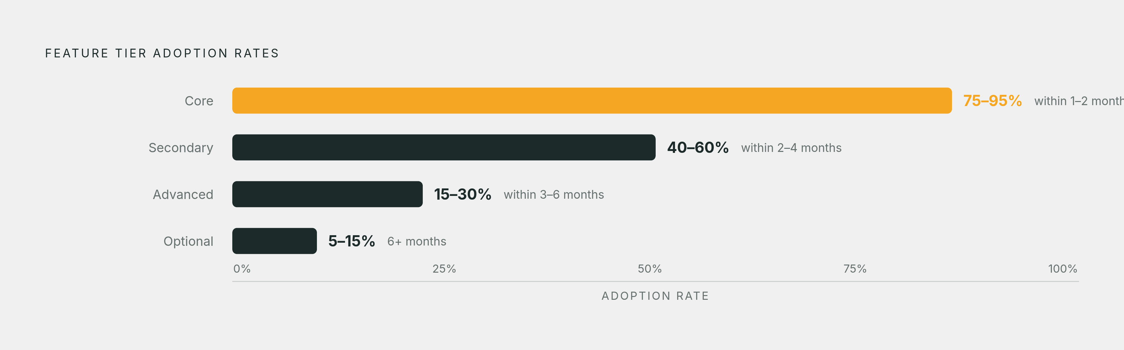
Feature-type tiers turn a vague benchmark into something a team can actually act on. Nice-to-have or optional features sit lowest, somewhere from 5 to 30% saasfactor.co.
A parallel table adds a timeline expectation to each tier, which matters just as much as the rate itself. Optional tools are just 5 to 15%, and that's expected to take six months or more. A feature judged against the wrong timeline looks broken when it's simply early.
Product type shifts the picture again. B2B SaaS products generally consider 30 to 50% good adoption wudpecker.io. Consumer apps run lower, typically 15 to 40% marketingltb.com. Enterprise software runs higher, 40 to 70%, largely because structured rollouts and formal training programs push adoption in a way self-serve products can't. Advanced features have a 15–30% adoption rate, within 3–6 months (saasfactor.co).
Role matters on top of all that. Power users, defined as more than 40% weekly usage, tend to be early adopters, and department leads specifically adopt roughly 30% faster than general staff marketingltb.com. Regular users run 15 to 40% weekly usage, and occasional users fall under 15%. Before comparing any number to a benchmark, place the feature in its tier first, then check whether the denominator actually reflects the users the feature was built for. Core features have a 75–95% adoption rate, expected within 1–2 months (guideflow.com). Secondary features have a 40–60% adoption rate, within 2–4 months (saasfactor.co).
Activation rate offers a useful parallel benchmark and a good illustration of how vertical context can flip depending on which metric gets measured. Average activation across B2B SaaS is 37.5%, median 37.04%, but AI and ML products lead at 54.8% while FinTech and insurance lag at just 5%. CRM and sales tools are 42.6%, HR at 8.3%. Notice that HR led the adoption benchmark earlier but trails badly on activation, proof that no single vertical performs uniformly well across every metric. Well-designed SaaS features generally are in the 40 to 60% activation range; anything under 30% usually points to onboarding friction or a value proposition that isn't landing. Core features (essential to the product's main function) have a 60–90% adoption rate. Secondary features (enhance the product but aren't essential) have a 20–60% adoption rate (marketingltb.com).
What a low adoption rate is actually telling you, the four-part diagnostic
A single adoption number can look identical for three completely different reasons: users never found the feature, users found it and abandoned it immediately, or users tried it once and never came back. Same number, three different fixes. Treating a low adoption rate as one problem instead of running the diagnostic is how teams end up redesigning a feature that was never broken.
Diagnosis one is discovery failure, and the signal is low breadth. Most low adoption is a discovery problem, not a quality one. Only 27% of launches include a targeted, behavioral adoption campaign, and passive launches without that push are just 8 to 15% adoption within 90 days. The fix here isn't a redesign, it's surfacing the feature at the moment the need occurs, in-app, contextually, rather than buried in a generic welcome tour.
Diagnosis two is activation friction, healthy breadth paired with low completion of the first meaningful action. One documented case involved an email feature where users saw it and opened it, but dropped off at domain verification before ever completing first use, a time-to-adopt problem rather than a discovery one. The fix is a targeted onboarding nudge at the exact friction step, not a full rebuild.
Diagnosis three is value misalignment: users try the feature, and simply don't come back. Adoption, remember, means consistent use driven by perceived value, not a one-time trial. The fix leans on demonstrating that value again, contextually, at the moment a user actually hits the problem the feature solves.
Diagnosis four is the wrong denominator, a feature that looks broken because the audience measured against it is too broad. Role-gated or plan-gated features measured against the entire active base will always look underwhelming. The fix is segmenting the cohort down to eligible users before comparing against any benchmark at all.
20 to 30% of SaaS features drive 80% of total usage, and feature bloat contributes to roughly 40% of product abandonment. The diagnostic matters beyond any one feature's number, because it's also a check against building things nobody asked for. And once a feature is healthy, cohort-based alerts should be automated: a 20% drop in usage frequency, a 50% jump in time between sessions, or a 30% decline in engagement duration are all early signs that a previously healthy feature is starting to erode. Per S1, 60–80% of features never reach meaningful adoption, as most users never discover them.
How adoption rate connects to retention and revenue, and why the gap between eligible and actual users has a dollar cost
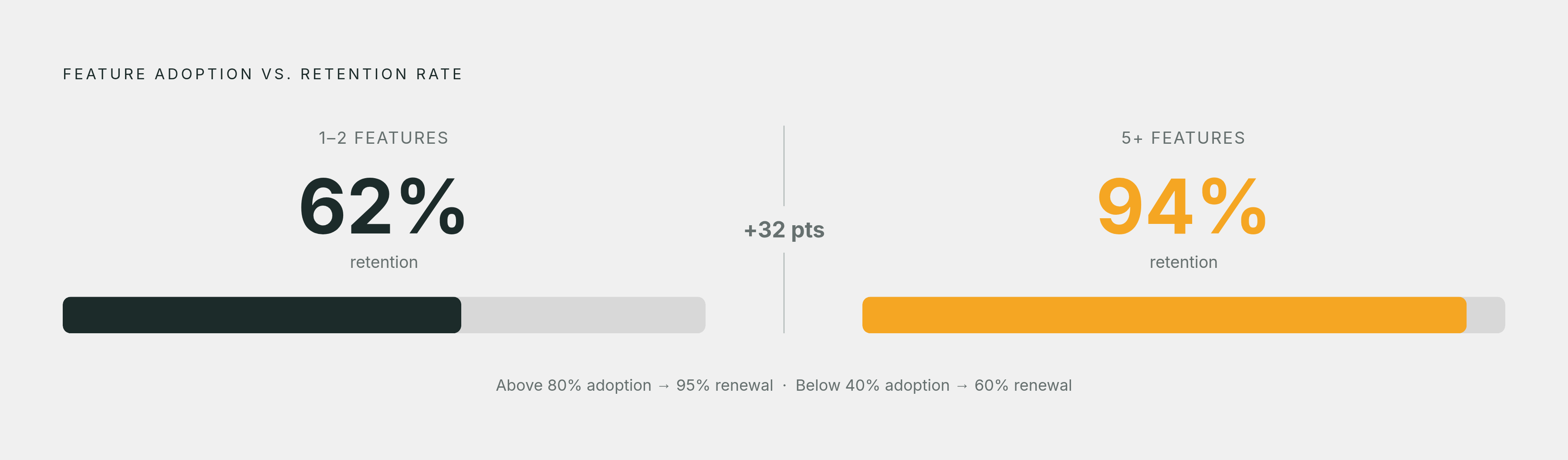
Adoption isn't just a product metric, it's a revenue metric wearing a product metric's clothes. Accounts using five or more features retain at 94%. That's not a small gap; it's the difference between a healthy renewal book and a leaky one.
Accounts with 80% or higher feature adoption carry a 95% renewal rate. Accounts below 40% adoption carry just 60%. Each additional core feature an account adopts cuts churn probability by roughly 8 to 12%. Separate retention research found that accounts adopting three or more features within their first 90 days saw 28% lower churn, specifically among those reached with behavioral triggers timed to the feature's introduction. Timing the nudge to the moment of relevance, not a generic drip campaign, is doing real work in that number.
For product-led growth companies specifically, activation and adoption feed straight into who converts. Users who activate quickly and adopt core features convert at a meaningfully different rate than users who signed up and barely engaged, and product-qualified leads get defined by a blend of usage frequency, adoption depth, and engagement pattern, not just a signup date. That's not a product statistic, that's wasted engineering time with a dollar figure behind it.
The practical takeaway for PLG teams is to segment by behavior, not by signup date or firmographic data. Account-level adoption numbers can hide individual pain. A team account might show healthy aggregate adoption while most of the individual seats inside it have never touched the feature once. The discovery gap has a compounding cost: per S1, SaaS companies spend 6–9 months building features before 60–80% of them fail to reach meaningful adoption, framing the gap as wasted development investment, not just a product metric.
Moving from diagnosis to action: what behavior-grounded guidance looks like in practice
The gap between who should be using a feature and who actually is isn't a footnote, it's the entire point of measuring adoption in the first place. That gap tells a team where to intervene, and for whom, far more precisely than a blended, product-wide percentage ever could.
Current account state, meaning who has access, what plan, what role, what configuration, tells a team who's eligible. Behavior over time, meaning what a user has actually done inside the product, tells a team who's engaged. Either one alone tells half a story. Combined, they tell a different story than either could on its own.
The direction product teams are heading in involves using AI to read product behavior, support conversations, survey responses, and feature requests together, rather than as separate reports living in separate tabs. The goal in that combination isn't more notifications landing in someone's inbox. It's helping each individual customer find the next feature that actually solves a problem they have right now, at the moment they have it. That's the same principle running through every section above, just automated: define the eligible cohort correctly, watch the behavior, and treat the resulting number as a pointer toward the fix, not a grade on the feature itself.