In-App Tooltips and Spotlights for New Feature Discovery
Behavioral triggers beat location-based ones for turning feature awareness into actual adoption.
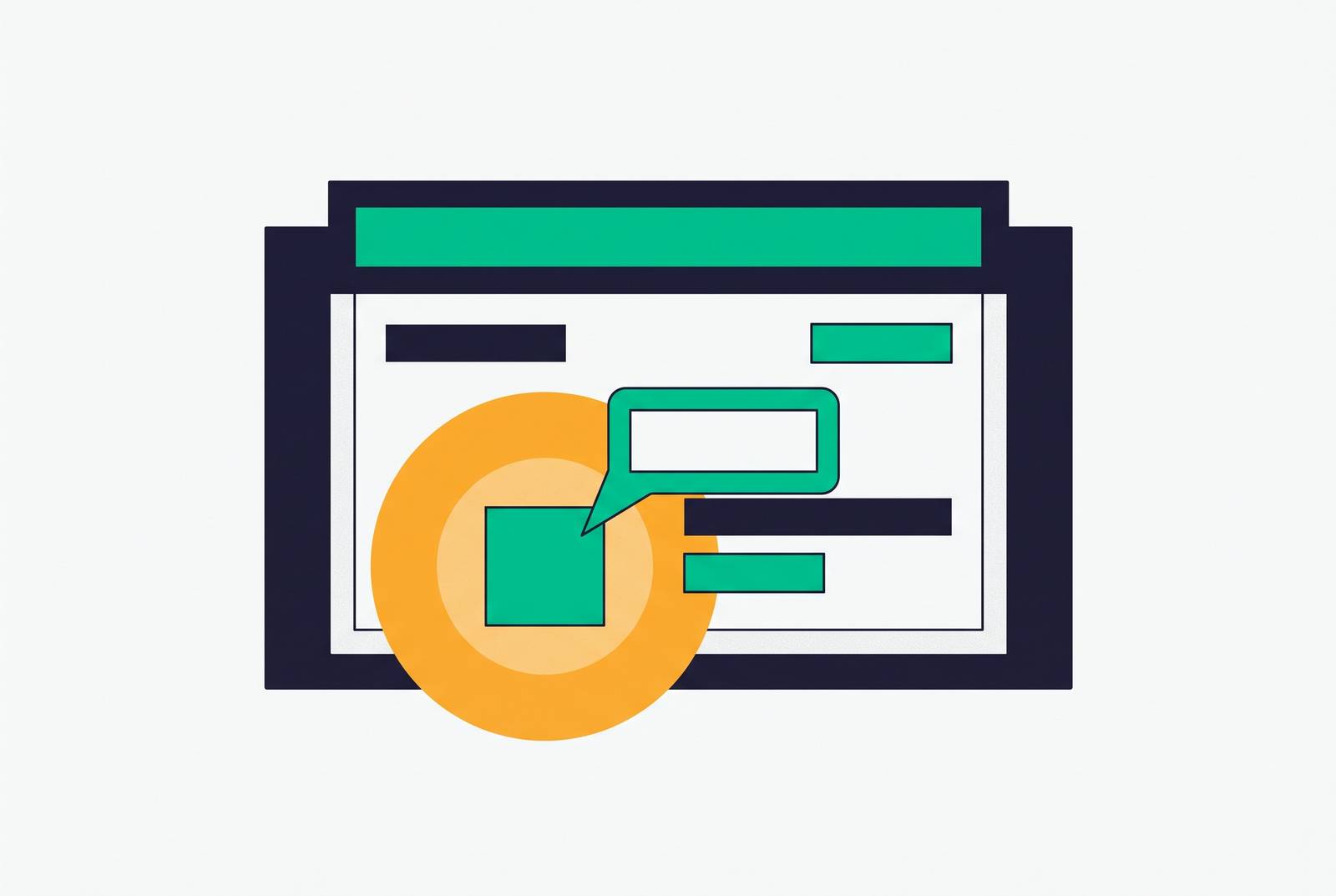
In-app tooltips and spotlights are one of the few feature-adoption tools that work at the exact moment a user needs them, but most teams fire them at the wrong moment for the wrong person. The fix is a trigger built from what a user has actually done, not where they happen to be clicking.
Why features go unnoticed after launch
A feature can ship cleanly and still die quietly because nothing connects the right user to it at the right time. The standard launch playbook, a changelog entry, an email blast, a dashboard banner, asks the user to already care enough to go looking. Only 27% of feature launches include targeted, behavioral campaigns that guide specific user segments toward the features relevant to their own workflow. Research from Zylo cited by StriveCloud found that a large majority of IT leaders have discovered AI-powered features running inside their own stack that they never knew existed, producing what StriveCloud calls the "shadow feature" problem. Features ship, users never find them, and the product team has no idea either. The average SaaS user regularly engages with only a small fraction of a product's distinct features, Pendo's 2025 State of Product report found, as cited by US Tech Automations. This is a mechanism problem, not a quality problem, and the rest of this piece is about what mechanism actually closes the gap.
Limits of in-app tooltips and spotlights
A tooltip is a small contextual overlay anchored to a specific element in the UI. A spotlight dims everything around it and focuses the user's attention on that one element. Together, they're the lightest-weight form of in-app guidance available: no modal to dismiss, no multi-step flow to commit to, nothing that asks for more than a glance. Digital adoption platforms deliver this kind of guidance by reading a page's structure and positioning elements contextually. The mechanism works inside the actual task rather than in a separate training module the user has to seek out.
Formats scale up from there. Tooltips and hotspots sit at the light end, spotlights follow, then modals, then full interactive walkthroughs that guide a user through several steps in sequence. Each step up asks more of the user's attention and time.
What none of these formats do on their own is explain why a feature matters to the specific person looking at it. A tooltip can point at a button. It cannot make a user understand what value clicking that button produces for their particular account, their particular role, or their particular problem that day. The first is a click. The second is adoption. Confusing the two is how teams end up believing a launch succeeded when all they actually measured was a glance.
Conditions that make lightweight tooltip guidance work
Tooltips and spotlights earn their place when they show up inside the workflow a feature belongs to, not before it and not to every user indiscriminately. Timing is the variable that decides everything else: a tooltip shown before a user reaches the relevant task is noise, and the same tooltip shown during that task is help. The standard across adoption-focused teams has shifted toward triggering guidance only when a user's behavior demonstrates relevant intent, rather than on a fixed schedule.
Kumu, a livestreaming platform, gives a clean example of this at the smallest possible scale. Its search bar was underused, so the team addressed it with a simple spotlight nudge targeted at the moment it would matter. That single intervention produced a 54% click-through rate, a result that reflects what happens when a lightweight nudge meets a user already in a state to act on it.
Asana's onboarding checklist works on a related principle, at a slightly larger scale. It detects what a user has already done, whether that's creating a project, adding a task, or inviting a teammate, and checks those steps off automatically instead of re-showing instructions for things the user has already figured out. Skipped steps resurface later with contextual prompts, rather than being repeated indiscriminately. That behavior reduces noise and respects what the user has already demonstrated about their own competence.
A priming effect, as StriveCloud's 2026 analysis calls it, connects both examples: the context in which a user first encounters a feature shapes how they perceive its value. A tooltip that surfaces a feature as the answer to something a user is already trying to do turns that feature from "another button in the interface" into a relevant solution. That reframing is the entire value proposition of lightweight guidance, and it only works under the right conditions.
Personalization has to extend down to the tooltip level itself. Guideflow's DAP guide points out that targeting prevents experienced users from being annoyed by basic tutorials meant for beginners. A first-time user and a power user inside the same product are at completely different points in their relationship with a feature, and showing them identical guidance wastes the attention of one group while under-serving the other.
The mismatch between a user's moment and a generic trigger
The most common tooltip failure has nothing to do with design quality. It comes from firing at the wrong moment for the wrong person, because the trigger is built on time elapsed or location in the UI rather than on what the user has actually done.
The clearest version of this failure is the tour that fires at login for every new user, regardless of who they are or what they came to do. It arrives before the user has any context for why the feature matters, produces nothing but surface compliance as users click through just to make it go away, and the feature is forgotten within days. US Tech Automations identifies wrong timing as the root cause behind one of the three structural failure modes it tracks in passive product launches.
Static, linear product tours have been losing ground to adaptive flows for exactly this reason: a fixed script has no way to account for what an individual user has already done, already knows, or actually needs at that moment. Single-touch announcements with no reinforcement built in leave most non-adopters never revisiting the feature.
One-size-fits-all messaging compounds the problem. When every user receives the same announcement regardless of role, plan, or prior behavior, most of them correctly conclude it isn't relevant to their situation and ignore it. StriveCloud's 2026 analysis found that 60% of SaaS clients are likely to churn if they don't receive personalized product experiences, putting a real cost on the assumption that broadcast messaging is good enough.
All of this points to the same underlying objection: tooltip-led strategies built on generic triggers produce surface compliance instead of durable behavior change. Users complete the walkthrough and never come back, because nothing in the experience gave them a reason grounded in their own situation. If the trigger is the actual point of failure, the next question is what a correct trigger looks like.
The right trigger layer: combining database state with product behavior
The correct trigger for introducing a feature is a specific pattern in that user's actual product behavior, read alongside their current account state, not a user's position in the UI or days since signup.
Those two data sources do different jobs, and the combination is what makes the trigger accurate. Product analytics captures behavior over time: what a user has done, and just as important, what they haven't done. Database state captures current context: plan tier, role, configuration, account properties. The gap between what should be happening, given that context, and what is actually happening is the real signal a team should be watching.
Notion's approach illustrates this at the feature level. Rather than waiting for a scheduled product tour, Notion watches for signals inside the moment: when a user stares at a blank page, it offers slash-command suggestions; when someone types a question, it suggests database views. Guidance stays invisible until the exact moment it's useful.
A construction project management SaaS company applied the same principle at the account level. A contextual tooltip appeared only when users accessed a legacy scheduling view, then triggered a four-step walkthrough using the user's own real data. That drove substantial feature adoption growth over six months, and the trigger was behavioral: accessing the legacy view signaled that the user was ready to consider a replacement, which a calendar date never could have told the team.
An enterprise HR platform used a role-based cascading model built on the same logic. HR Directors received walkthroughs first; once they activated the feature, Workforce Planners received contextual guidance triggered by that activation event. The trigger for the second cohort was a behavioral event inside the first cohort, not a date on a calendar, and adoption grew meaningfully over the following 12 months.
The database already tracks plan, role, and configuration. The analytics layer already logs behavior. The gap is rarely a missing tracking plan. It's the absence of a system that connects the two and acts on what they show together, given that the two data sources are complementary: product analytics captures behavior over time, database state captures current context, and the gap between what should be happening and what is happening is the actual signal. That absence is the actual problem feature adoption tools exist to solve, and it's the design question that separates analytics-only platforms from systems built to act on the data they collect. Platforms read individual user behavior and send guidance grounded in that behavior at the moment it's relevant, rather than broadcasting one announcement to an entire user base, which replaces passive discovery with a prescriptive nudge rooted in what a specific person has actually done.
Interactive walkthroughs versus passive tooltips: where format depth matters
Getting the trigger right is necessary but not sufficient. Once a tooltip fires at the correct moment, the depth of the guidance format still decides whether the user crosses the line from noticing a feature to actually using it. Interactive walkthroughs that guide a user through three to five steps inside the product convert at a substantially higher rate than passive tooltips, and that gap closes specifically when the walkthrough uses the user's real data and fires at genuine need rather than functioning as product-tour theater at signup.
The construction SaaS case makes the point concretely. Its four-step walkthrough used real scheduling data the user already had sitting in the product, not placeholder content built to look like a demo. That's the detail that explains why the walkthrough moved adoption instead of producing a single dismissal click: the user was looking at their own numbers, not a hypothetical example.
Notion has grown into a company valued in the billions, and its contextual, template-driven approach to guidance has been one contributing factor among several in that growth, alongside its broader product design and market timing. Format depth alone doesn't explain a company's valuation, but even a well-triggered, well-designed walkthrough only produces activation, meaning first contact with a feature. Getting a user across that first threshold is a format question. Knowing whether they ever come back is a different question entirely, and it requires a different measurement architecture to answer.
Measuring whether guidance changed behavior, not just whether it was seen
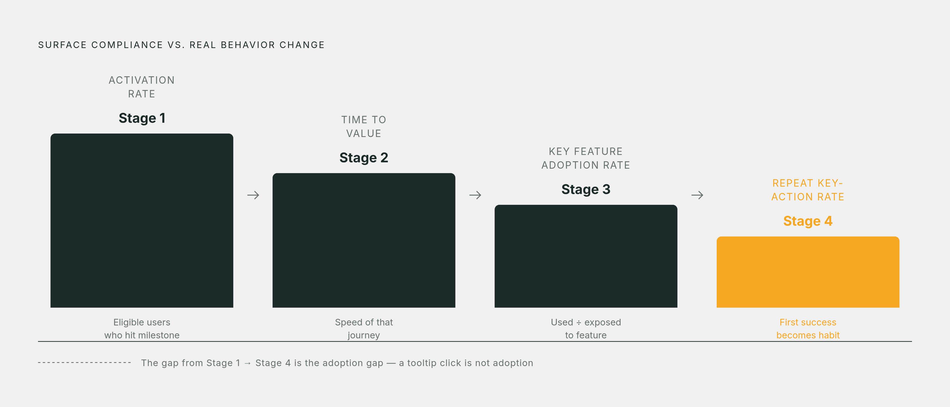
Activation and adoption are not the same metric, and most teams track the one that flatters their dashboard rather than the one that reflects reality. A tooltip click in a funnel report says nothing about whether a user folded that feature into how they actually work.
Activation means a user experienced the feature once. Adoption means they came back to it on their own, with no tooltip pointing the way, because it had become part of their actual workflow. That distinction, drawn from US Tech Automations' 2026 adoption guide, marks the line between surface compliance and behavior change that actually lasts.
A measurement architecture built around that distinction needs several layers working together: activation rate, tracking the share of eligible new users who reach the first value milestone; time to value, tracking how long that takes; key feature adoption rate, calculated as eligible users who used the feature divided by eligible users exposed to it; and repeat key-action rate, tracking whether that first success turns into a habit rather than a one-time event.
This same logic extends to any system meant to observe behavior and act on it over time. Tools that combine user analytics with backend account state can identify the specific moment a user would benefit most from learning a given feature, and trigger guidance only when the actual conditions for adoption are present, rather than on a fixed interval or a generic segment rule. That's the mechanism a feature adoption strategy is actually built around: not a format, and not a single well-placed tooltip, but a system that keeps watching what a user does and keeps the guidance matched to it.