Cancellation Flow Design That Recovers At-Risk Accounts
How to save canceling customers by fixing adoption problems before they hit cancel.
Cancellation is the visible end of a problem that started much earlier. By the time someone clicks cancel, they've usually spent weeks running into the same wall: a feature they couldn't figure out, a price that stopped feeling worth it, a workflow they gave up on. The click itself is just paperwork. The real decision got made earlier, often without anyone on the product or customer success team noticing. That timing gap matters because it sets a hard limit on what any cancel flow can do. A well-built flow can only save an account that still has a reason to stay. An account that never got real value from the product has nothing to return to, no matter how good the offer on the screen in front of them is. The cancel screen and the adoption failure behind it are two different problems, and solving the first without touching the second will always cap how much churn actually goes down.
Behavioral signals before the cancel click
Long before anyone opens a billing page, the product itself is already saying what's wrong. The useful signal is the gap between what a customer should be doing, given their plan and stage, and what they're actually doing, not raw activity. A customer on a plan that includes advanced reporting but who has never opened the reporting tab is carrying a different kind of risk than someone who used that tool daily for three months and then stopped cold. Both might cancel. They need completely different interventions, and you can only tell them apart by looking at behavior, not account health scores.
Getting this right means combining two data sources that teams often keep separate: the current state of the account (plan tier, user role, configuration choices, which onboarding milestones got completed) and the behavioral history that built up around it (feature use over time, session rhythm, any integrations connected or disconnected). Combining those two data sources turns a low-usage alert into something diagnostic. Without that pairing, all you get is a generic "usage is down" flag, which tells a team that something's wrong but nothing about why or what to do next.
This matters because the common reasons people give for canceling, price, missing features, low usage, a competitor switch, a temporary budget freeze, an accidental signup, each leaves its own fingerprint in the product record well before the cancel screen ever loads. Someone needs to be watching for that fingerprint before the cancellation happens, not after.
Why catching adoption failure early produces disproportionate results
Stepping in at the first sign of adoption trouble produces a far higher recovery rate than anything achievable at the cancel screen, because the person still has a working relationship with the product worth saving. A customer who has never reached repeated, successful use of a core feature has no positive experience to weigh against the decision to leave. No discount offered at cancellation can manufacture that missing experience after the fact. It simply doesn't exist to draw on.
Feature adoption among active users on paid plans, specifically whether someone has ever touched the features that justified their upgrade in the first place, is the leading indicator to track. By the time a usage-drop alert fires, the adoption failure has been sitting there for weeks already, and sometimes no alert fires. That lag is the entire argument for working further upstream: the earlier the failure gets caught, the cheaper and more effective the fix.
What actually matters is whether the customer performed the specific behavior that predicts they'll keep using the product, not opens, clicks, or a composite health score. A report showing plenty of logins and page views says nothing about retention risk if none of those sessions touched the feature that drives renewal. A dashboard describes what happened; a system built to act on what's happening does something about it. A dashboard tells a team where the fire is after the building's already burning. A system built around adoption behavior catches the spark and does something about it immediately, routing a message, a task, or a human outreach to the account before it ever reaches a cancel screen.
What a well-designed cancel flow needs to do
A cancellation flow that actually works has to do five things at once. It needs to find out the real reason someone is leaving. And it needs to build in a way back, so win-back outreach has somewhere to send the customer later.
Most cancellation flows accomplish none of this. Neither approach learns anything about why the customer left. The subscription just ends, often before anyone on the team even registers that it happened. That's a real cost given that research shows 20 to 30 percent of customers who click cancel would have stayed if they'd been offered the right intervention at the right moment.
Sequence matters as much as content. Offering a retention deal before understanding why someone wants to leave is why generic discounts fail so often. Worse, it confirms the gap exists without doing anything to close it, and wastes the one meaningful offer a team had a chance to make.
Flows that underperform tend to repeat the same five mistakes, each avoidable. And treating every cancellation the same with one generic offer wastes that offer on accounts that were never going to stay, while missing the ones that actually could have been saved with the right match.
Structuring the flow from cancel click to confirmed exit
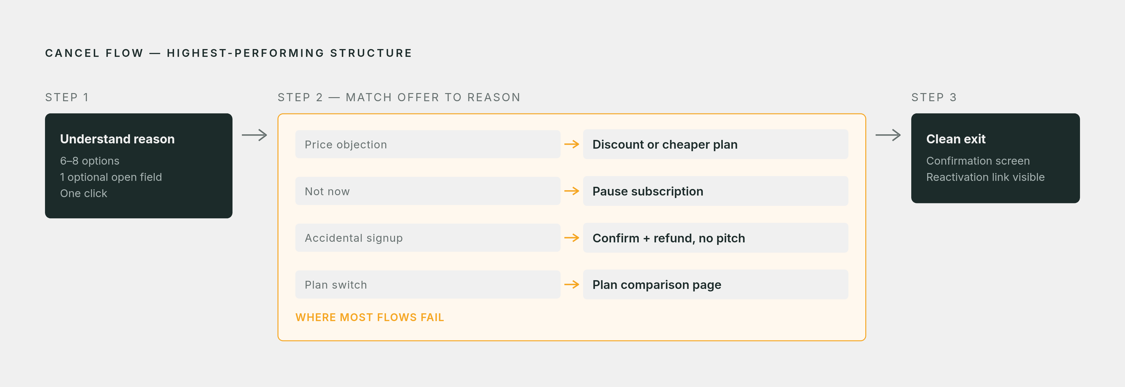
The flow that performs best follows three steps in strict order: understand the reason, match an offer to that reason, and if the offer gets declined, let the person exit cleanly. That order beats both extremes, the empty confirmation screen that asks nothing, and the friction-heavy obstacle course that asks too much.
The first step is the entry point itself. The cancel option belongs somewhere customers expect to find it, under Billing, Subscription Management, or Account Settings, and reaching the flow should take no more than two clicks. This isn't just a courtesy. Making it hard to leave costs more than it saves.
The second step is a short reason survey: one multiple-choice question with six to eight options, plus one optional open-text field for anyone who wants to say more. The goal here is intent data, not a conversation, so the whole thing should take one click to complete. Whatever reason the customer selects should drive every decision the flow makes from that point forward.
The third step is the offer, and it has to match the reason given. Price objections get a temporary discount or a cheaper plan to downgrade into. Someone who says they no longer need the product right now, or who's dealing with a temporary gap, gets offered a pause for a set number of weeks or months. Someone who signed up by accident should have their cancellation confirmed immediately, with a refund offered and no retention pitch at all, since there's nothing to retain. And someone switching plans should go straight to the plan comparison page rather than through a reason-matched offer meant for people leaving.
If the offer gets turned down at any point, the flow should close out cleanly, with a reactivation link visible right there on the confirmation screen. That link matters. It's the entry point for win-back outreach later, and leaving it out of the final screen throws away a channel that costs nothing to keep open.
Why the pause option is underused
Most cancel flows skip the pause option entirely, which is a mistake given what it's built to solve. A customer is either "not now" or "never again. A customer in the "not now" category doesn't have an objection to the product. They have a timing problem, a budget crunch, or a short-term reason to step away. Offering them a discount solves a problem they don't have, and often doesn't move them.
A pause fits budget-pressure cancellations particularly well, the kind common among startups and small or mid-sized businesses going through a lean quarter. For both groups, a pause gives them a way to leave the bill behind for a while without closing the door, which a straight cancellation forces them to do.
The downgrade path deserves a place in the same conversation. Customers who accept a downgrade instead of canceling outright stay meaningfully longer than customers who cancel. Despite that, downgrade options are often missing from cancel flows, usually because teams worry about the hit to revenue without ever modeling what retaining that customer at a lower price is actually worth compared to losing them completely.
What the regulatory environment now requires of cancel flows
Friction-based cancellation design isn't a strategy teams get to choose anymore. Regulators in multiple places have made specific cancellation mechanics a legal requirement, which lines up with what good flow design already recommends: clear, honest, reason-matched, not padded with extra screens meant to wear the customer down.
California's amended Automatic Renewal Law took effect July 1, 2025, and requires a prominently placed cancel button or link inside account settings. The law still allows retention offers during cancellation, but each one has to appear alongside an equally prominent "click to cancel" option, so the offer can never replace or obscure the exit. A multi-country bloc is rolling out similar requirements starting June 19, 2026. One member country has already required a two-click cancellation process for online subscriptions since July 2022, and as of June 19, 2026, a separate withdrawal button applies to general distance-selling contracts under that country's civil code.
None of this should alarm a team that's already building flows the right way. It confirms the direction. Teams that built friction-heavy flows specifically to suppress their churn numbers now have a legal reason, not just a brand reason, to rebuild them. Stacking multiple retention screens or hiding the final cancel button behind repeated confirmations is now a compliance and chargeback risk.
California's law matters here for another reason: it limits each cancellation to one coherent offer displayed alongside the cancel option. That single-offer constraint raises the stakes on getting the reason right. If there's only one shot at an offer, it has to match what the customer actually said. A generic discount handed to someone leaving for a reason that has nothing to do with price is now both a wasted conversion opportunity and a flow that doesn't hold up under the new rules.
How the exit survey feeds the upstream adoption system
The reason someone gives when they cancel is worth more as a signal pointing backward than as a line in a churn report. When a cluster of cancellations shares the same stated reason, a missing feature, not enough usage, a move to a competitor, that's product feedback from the exact group of customers who made it all the way to the cancel screen. The same adoption failures keep producing the same outcome month after month when that pattern is ignored.
A "not using enough" reason, in particular, points at something upstream of the cancel flow itself. It might mean the activation definition the team is using is wrong, or that onboarding isn't actually getting people to the moment where the product's core value becomes obvious, or that an alert meant to catch low adoption before day 30 or 60 simply never fired. The cancel flow confirms where the upstream system already missed the problem it's measuring.
A "switched to a competitor" cluster deserves the same treatment, with the added step of capturing which competitor and why through the open-text follow-up. Treating exit survey data purely as a churn report is like reading a symptom without ever diagnosing what caused it. The cancel flow shows what broke. The fix lives in the adoption work that came before it.
A connected retention system: cancel flow, exit data, and upstream adoption work
A real retention system has three layers working together, not one screen trying to do everything by itself. The upstream layer pairs current account state, plan, role, configuration, onboarding milestones completed, with behavioral history, feature adoption over time, session patterns, integration activity, to find the gap between what an account should be doing and what it's actually doing. None of this requires new instrumentation. It requires connecting data most teams are already collecting but keeping in separate systems.
The intervention layer acts on that gap. When it's large enough and specific enough to act on, the right move is a message grounded in what the customer actually did or didn't do in the product, not a broadcast sent to an entire segment. That specificity is what gets it read. A message that says "you haven't yet set up the integration that drives most of the value on your plan" lands differently than a generic check-in email, because it's about something real and traceable in the account.
The cancel-screen layer comes next, and by the time it does, it's working with a much smaller group of accounts, because the upstream layer has already caught and recovered the ones that were reachable earlier. What's left is a reason survey, one offer matched to the stated reason, and a clean exit that keeps the win-back door open.
The feedback layer closes the loop. Cancellation reasons flow back into how the team defines activation, how onboarding gets sequenced, and what triggers an early intervention the next time around. Each cohort that moves through the system makes the next one a little sharper, instead of the team running the same rescue operation at the same late stage every single time.